Note
Access to this page requires authorization. You can try signing in or changing directories.
Access to this page requires authorization. You can try changing directories.
Note
This article applies to Visual Studio 2015. If you're looking for the latest Visual Studio documentation, see Visual Studio documentation. We recommend upgrading to the latest version of Visual Studio. Download it here
When you are designing UI that uses common Visual Studio shell elements, or you would like your interface element to be consistent with similar features, use existing token names in package definition files to choose and assign colors. This ensures that your UI stays consistent with the overall Visual Studio environment and that it updates automatically when themes are added or updated.
This article describes common UI elements and the token names that they use, which you can reference when building similar UI. For specific information about how to access these color tokens, see The VSColor Service.
Make sure to use token names correctly:
Use token names based on function, not on the color itself. The common shared colors are associated with specific interface elements and are only intended to be used for the same or similar features. For example, don't reuse the color of a pressed combo box for a spinning progress animation just because you like the color. The functions of the combo box and the animation are different, and if the color associated with the combo box changes, it may no longer be an appropriate color for your animation element. Consistent use of color helps orient your users and prevent confusion.
Use background and text colors in the correct combination. Background colors that are intended to be used with text will have an associated text color. Don't use text colors other than what is specified for that background. If there is not an associated text color, don't use that background color for any surface on which you expect to display text. Other combinations of text and background colors may result in an unreadable interface.
Use control colors that are appropriate for their location. In certain states, some Visual Studio controls do not have separate border and background colors. Instead, they pick up those colors from the surfaces behind them. Make sure that you always use the token names that are appropriate for the location where you are placing the control.
Important
Do not use tokens found in the categories "Start Page" or "Cider."
Command structures
Menus
Menus can occur at several places within Visual Studio: the main menu bar, embedded in document or tool windows, or on right-click in various locations throughout the IDE. Implementations of menus associated with other UI elements are discussed in the section for the respective element. You should always use the standard menu implementation provided by the Visual Studio environment. However, in some rare instances you might not have access to the standard Visual Studio menus. In these situations, use the following token names to ensure that your UI is consistent with other menus in Visual Studio.
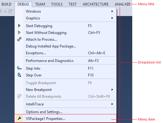
Use …
whenever you need to create a custom menu.
when you have a new UI component that you want to match the Visual Studio menus.
Do not use … the background color alone. Always use the background/foreground combination as specified.
Menu title
Menu titles consist of a background, a border, and the title text, as well as an optional glyph, usually when the menu is found in a command bar.
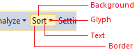
Use… whenever you are creating a custom menu title.
Do not use…
for anything that you don't want to always match the menu title.
in any background/foreground combination other than specified.
Default
Component
Element
Token name: Category.color
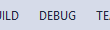
Menu title
Background
None
Foreground (Text)
Environment.CommandBarTextActive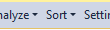
Menu title with glyph
Foreground (Glyph)
Environment.CommandBarMenuGlyphBorder
None
Hover
Component
Element
Token name: Category.color
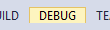
Menu title
Background
Environment.CommandBarMouseOverBackgroundBeginWhile not used in modern themed UI, there are gradient stops and values for this background.
Foreground (Text)
Environment.CommandBarTextHover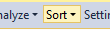
Menu title with glyph
Foreground (Glyph)
Environment.CommandBarMenuMouseOverGlyphBorder
Environment.CommandBarBorderPressed
Component
Element
Token name: Category.color
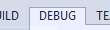
Menu title
Background
Environment.CommandBarMenuBackgroundGradientBeginWhile not used in modern themed UI, there are gradient stops and values for this background.
Foreground (Text)
Environment.CommandBarTextActive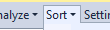
Menu title with glyph
Foreground (Glyph)
Environment.CommandBarMenuMouseDownGlyphBorder
Environment.CommandBarMenuBorderOnly left, top, and right sides.
Disabled
Component
Element
Token name: Category.color
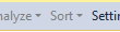
Menu title with glyph
Background
None
Foreground (Text)
Environment.CommandBarTextInactiveForeground (Glyph)
Environment.CommandBarTextInactiveBorder
None
Menu
An individual menu item consists of the menu text and an optional icon, check box, or submenu glyph. Its background and text color change on hover. This color token is a background/foreground pair.
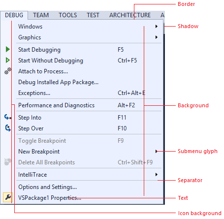
Use… for any drop-down list that is launched from a menu bar or command bar.
Do not use…
for any drop-down list that occurs in another context.
in any background/foreground combination other than specified.
Default
Component
Element
Token name: Category.color
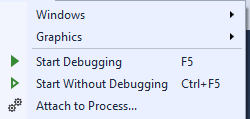
Menu
Background
Environment.CommandBarMenuBackgroundGradientBeginWhile not used in modern themed UI, there are gradient stops and values for this background.
Foreground (Text)
Environment.CommandBarTextActiveForeground (Submenu glyph)
Environment.CommandBarMenuSubmenuGlyphBorder
Environment.CommandBarMenuBorderIcon channel background
Environment.CommandBarMenuIconBackgroundSeparator
Environment.CommandBarMenuSeparatorShadow
Environment.DropShadowBackground
Checked
Check mark
Environment.CommandBarCheckBoxCheck mark background
Environment.CommandBarSelectedIcon
Selected
Icon background
Environment.CommandBarSelectedIcon border
Environment.CommandBarSelectedBorderHover
Component
Element
Token name: Category.color

Menu item
Background
Environment.CommandBarMenuItemMouseOverForeground (Text)
Environment.CommandBarMenuItemMouseOverForeground (Submenu glyph)
Environment.CommandBarMenuMouseOverSubmenuGlyph
Checked
Check mark
Environment.CommandBarCheckBoxMouseOverCheck mark background
Environment.CommandBarHoverOverSelectedIcon
Selected
Icon background
Environment.CommandBarHoverOverSelectedIcon border
Environment.CommandBarHoverOverSelectedIconBorderDisabled
Component
Element
Token name: Category.color

Menu item
Foreground (Text)
Environment.CommandBarTextInactiveForeground (Submenu glyph)
Environment.CommandBarMenuSubmenuGlyph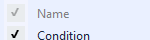
Checked
Check mark
Environment.CommandBarCheckBoxDisabledCheck mark background
Environment.CommandBarSelectedIconDisabled
Command bar
The command bar can appear in multiple places within the Visual Studio IDE, most notably the command shelf and embedded in tool or document windows.
In general, always use the standard command bar implementation provided by the Visual Studio environment. Using the standard mechanism ensures that all visual details will appear correctly and that interactive elements, will behave consistently with other Visual Studio command bar controls. However, if it is necessary for you to build your own command bar, make sure you style it correctly using the following token names.


Use… in places where you need an embedded command bar but are unable to use the standard Visual Studio command bar implementation.
Do not use…
for UI elements that are not similar to a command bar.
for command bar components other than the ones for which token names are specified.
Command bar group
A command bar group consists of a related set of command bar controls and might contain any number of buttons, split buttons, drop-down menus, combo boxes, or menus. Colors for those controls are regulated by separate token names and are discussed individually elsewhere in this guide. A separator line is used to divide a command bar group into related subgroups.

Use… in places where you need an embedded command bar but are unable to use the standard Visual Studio command bar implementation.
Do not use…
for UI elements that are not similar to a command bar.
for command bar components other than the ones for which token names are specified.
Default (no other states)
Element
Token name: Category.color
Background
Environment.CommandBarGradientBeginWhile not used in modern themed UI, there are gradient stops and values for this background.
Border
Environment.CommandBarToolBarBorderDrag handle
Environment.CommandBarDragHandleSeparator
Environment.CommandBarToolBarSeparatorEnvironment.CommandBarToolBarSeparatorHighlight
Command icons
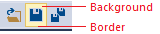
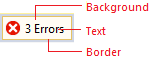
Use… for any buttons that will be placed on a command bar.
Do not use…
for controls that have their own token names.
in any background/foreground combination other than specified.
Default
Component
Element
Token name: Category.color

Default
Background
N/A (inherits from command bar background)
Foreground (Text)
Environment.CommandBarTextActiveBorder
N/A

Selected
Background
Environment.CommandBarSelectedForeground (Text)
Environment.CommandBarTextSelectedBorder
Environment.CommandBarSelectedBorderHover and keyboard focused
Component
Element
Token name: Category.color

Standard on hover
Background
Environment.CommandBarMouseOverBackgroundBeginWhile not used in modern themed UI, there are gradient stops and values for this background.
Foreground (Text)
Environment.CommandBarTextHoverBorder
Environment.CommandBarBorder
Selected on hover
Background
Environment.CommandBarHoverOverSelectedForeground (Text)
Environment.CommandBarTextHoverOverSelectedBorder
Environment.CommandBarHoverOverSelectedIconBorderPressed
Component
Element
Token name: Category.color

Pressed command icon
Background
Environment.CommandBarMouseDownBackgroundBeginWhile not used in modern themed UI, there are gradient stops and values for this background.
Foreground (Text)
Environment.CommandBarTextMouseDownBorder
Environment.CommandBarBorderDisabled
Component
Element
Token name: Category.color

Disabled command icon
Background
N/A (inherits from command bar background)
Foreground (Text)
Environment.CommandBarTextInactiveBorder
N/A
Combo box
Important
Combo boxes are similar to drop-downs, but include an editable text region. If your drop-down does not include an editable text region, use the color tokens found under Drop-down.
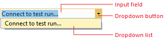
Use …
when building custom combo boxes.
when creating a command bar control that is similar to a combo box.
Do not use …
- for anything you don’t want always to match the command bar UI.
when you have access to a styled combo box.
Default
Component
Element
Token name: Category.color

Input field
Background
Environment.ComboBoxBackgroundForeground (Text)
Environment.ComboBoxTextBorder
Environment.ComboBoxBorderSeparator
No separator

Drop-down button
Background
N/A (inherits)
Foreground (Glyph)
Environment.ComboBoxGlyph
Drop-down list
Background
Environment.ComboBoxPopupBackgroundBeginWhile not used in modern themed UI, there are gradient stops and values for this background.
Foreground (Text)
Environment.ComboBoxItemTextBorder
Environment.ComboBoxPopupBorderHover
Component
Element
Token name: Category.color

Input field
Background
Environment.ComboBoxMouseOverBackgroundBeginWhile not used in modern themed UI, there are gradient stops and values for this background.
Foreground (Text)
Environment.ComboBoxMouseOverTextBorder
Environment.ComboBoxMouseOverBorderSeparator
Environment.ComboBoxMouseOverSeparator
Drop-down button
Background
Environment.ComboBoxButtonMouseOverBackgroundForeground (Glyph)
Environment.ComboBoxMouseOverGlyph
Drop-down list
Background (Menu item)
Environment.ComboBoxItemMouseOverBackgroundForeground (Text)
Environment.ComboBoxItemMouseOverTextBorder (Menu item)
Environment.ComboBoxItemMouseOverBorderFocused
Component
Element
Token name: Color.category

Input field
Background
Environment.ComboBoxFocusedBackgroundForeground (Text)
Environment.ComboBoxFocusedTextBorder
Environment.ComboBoxFocusedBorderSeparator
Environment.ComboBoxFocusedButtonSeparator
Drop-down button
Background
Environment.ComboBoxFocusedButtonBackgroundForeground (Glyph)
Environment.ComboBoxFocusedGlyphPressed
Component
Element
Token name: Color.category

Input field
Background
Environment.ComboBoxMouseDownBackgroundForeground (Text)
Environment.ComboBoxMouseDownTextBorder
Environment.ComboBoxMouseDownBorderSeparator
Environment.ComboBoxMouseDownSeparator
Drop-down button
Background
Environment.ComboBoxButtonMouseDownBackgroundForeground (Glyph)
Environment.ComboBoxMouseDownGlyphDisabled

Input field
Background
Environment.ComboBoxDisabledBackgroundForeground (Text)
Environment.ComboBoxDisabledTextBorder
Environment.ComboBoxDisabledBorderSeparator
No separator

Drop-down button
Background
None
Foreground (Glyph)
Environment.ComboBoxDisabledGlyph
Drop-down
Important
Drop-downs are similar to combo boxes, but lack editable text regions. If your drop-down includes an editable text region, use the color tokens found under Combo box.
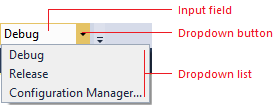
Use … when you are creating custom drop-down list controls.
Do not use …
for anything that is not similar to a drop-down list.
for combo boxes or split buttons.
Default
Component
Element
Token name: Category.color

Selection field
Background
Environment.DropDownBackgroundForeground (Text)
DropDownTextBorder
DropDownBorderSeparator
No separator

Drop-down button
Background
None
Foreground (Glyph)
Environment.DropDownGlyph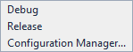
Drop-down list
Background
Environment.DropDownPopupBackgroundBeginWhile not used in modern themed UI, there are gradient stops and values for this background.
Foreground (Text)
Environment.ComboBoxItemTextBorder
Environment.DropDownPopupBorderShadow
Environment.DropShadowBackgroundHover
Component
Element
Token name: Category.color

Selection field
Background
Environment.DropDownMouseOverBackgroundBeginWhile not used in modern themed UI, there are gradient stops and values for this background.
Foreground (Text)
Environment.DropDownMouseOverTextBorder
Environment.DropDownMouseOverBorderSeparator
Environment.DropDownButtonMouseOverSeparator
Drop-down button
Background
Environment.DropDownButtonMouseOverBackgroundForeground (Glyph)
Environment.DropDownMouseOverGlyph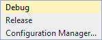
Drop-down list
Background (Menu item)
Environment.ComboBoxItemMouseOverBackgroundForeground (Text)
Environment.ComboBoxItemMouseOverTextBorder (Menu item)
Environment.ComboBoxItemMouseOverBorderPressed
Component
Element
Token name: Category.color

Selection field
Background
Environment.DropDownMouseDownBackgroundForeground (Text)
Environment.DropDownMouseDownTextBorder
Environment.DropDownMouseDownBorderSeparator
Environment.DropDownButtonMouseDownSeparator
Drop-down button
Background
Environment.DropDownButtonMouseDownBackgroundForeground (Glyph)
Environment.DropDownMouseDownGlyphDisabled
Component
Element
Token name: Category.color

Background
Environment.DropDownDisabledBackgroundForeground (Text)
Environment.DropDownDisabledTextBorder
Environment.DropDownDisabledBorderSeparator
No separator

Background
N/A
Foreground (Glyph)
Environment.DropDownDisabledGlyph
Split button
Split buttons share many token names with other command bar controls, such as buttons, menus, and command bar text. All necessary action and drop-down button token names are repeated here for convenience. Split button drop-down lists are implementations of command bar Menus.
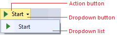
Use … when you are building a custom split button.
Do not use …
for other kinds of buttons.
in any background/foreground combination other than specified.
Default
Component
Element
Token name: Category.color

Split button (default)
Background
None
Foreground (Text)
Environment.CommandBarTextActiveForeground (Glyph)
Environment.CommandBarSplitButtonGlyphBorder
N/A
Separator
N/A
Hover
Component
Element
Token name: Category.color

Split button (on hover)
Background
Environment.CommandBarMouseOverBackgroundBeginWhile not used in modern themed UI, there are gradient stops and values for this background.
Foreground (Text)
Environment.CommandBarTextHoverForeground (Glyph)
Environment.CommandBarSplitButtonMouseOverGlyphBorder
Environment.CommandBarBorderSeparator
Environment.CommandBarSplitButtonSeparatorPressed
Component
Element
Token name: Category.color

Split button (pressed)
Background
Environment.CommandBarMouseDownBackgroundBeginWhile not used in modern themed UI, there are gradient stops and values for this background.
Foreground (Text)
Environment.CommandBarTextMouseDownForeground (Glyph)
Environment.CommandBarSplitButtonMouseDownGlyphBorder
Environment.CommandBarBorderSeparator
N/A
Disabled
Component
Element
Token name: Category.color

Split button (disabled)
Background
N/A
Foreground (Text)
Environment.ComboBoxItemTextInactiveForeground (Glyph)
Environment.CommandBarTextInactiveBorder
N/A
Separator
N/A
‘More options’ and ‘Overflow’ buttons
The "More options" button is used when a command bar group is customizable by either adding or removing related command bar buttons. The "Overflow" button appears when a command bar is truncated due to lack of horizontal space, and on click shows a menu containing the command bar buttons that cannot be displayed. Colors for these two buttons are controlled by the same set of token names.
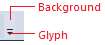
Use … for custom 'More options' or 'Overflow' buttons.
Do not use … for buttons that don't have similar functionality to a 'More options' or 'Overflow' button.
Default
Component
Element
Token name: Category.color

More options

Overflow
Background
Environment.CommandBarOptionsBackground
Foreground (Glyph)
Environment.CommandBarOptionsGlyph
Hover
Component
Element
Token name: Category.color

More options

Overflow
Background
Environment.CommandBarOptionsMouseOverBackgroundBegin
While not used in modern themed UI, there are gradient stops and values for this background.
Foreground (Glyph)
Environment.CommandBarOptionsMouseDownGlyph
Pressed
Component
Element
Token name: Category.color

More options

Overflow
Background
Environment.CommandBarOptionsMouseDownBackgroundBegin
While not used in modern themed UI, there are gradient stops and values for this background.
Foreground (Glyph)
Environment.CommandBarOptionsMouseDownGlyph
Document windows
There is no need to replicate document windows, because they are provided by the Visual Studio environment. However, you might decide that you want to leverage the colors used in document windows so that your UI always appears consistent with this part of the Visual Studio environment.
When using document window color tokens, you must be careful to use them only for similar elements, and always in pairs. If you do not do so, you will have unexpected results in your UI.
Document window frame
Document windows can be either docked in the IDE or floating as a separate window. When a document window is floating outside the IDE, it still sits in a document well, and has background, border, text, and tab colors that are the same as when it is part of the IDE. However, the document sits inside a frame that has its own background, border, and text colors. When tool windows are docked in the document well, they inherit the behavior and color for their tabs from document window token names.
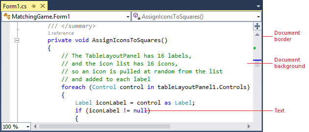
Docked document window
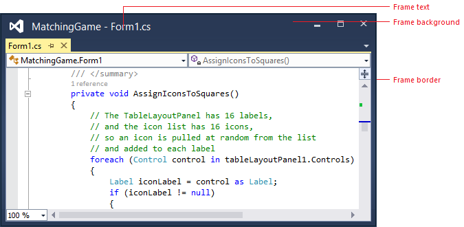
Floating document window
Use … anywhere you are creating UI that you want to match the document window.
Do not use … for any UI that you don't want automatically to change if the shell has a theme update.
Default
Component
Element
Token name: Category.color
Document: docked or floating
Background
Depends on document type
Foreground (Text)
Depends on document type
Border
Environment.ToolWindowBorder

Frame: floating, focused
Background
Environment.ToolWindowFloatingFrame
Foreground (Text)
Environment.ToolWindowFloatingFrame
Foreground (Glyph)
Environment.RaftedWindowButtonActiveGlyph
Border
Environment.MainWindowActiveDefaultBorder
Border (Glyph)
Environment.RaftedWindowButtonActiveBorder
Set to transparent

Frame: floating, unfocused
Background
Environment.ToolWindowFloatingFrameInactive
Foreground (Text)
Environment.ToolWindowFloatingFrameInactive
Foreground (Glyph)
Environment.RaftedWindowButtonInactiveGlyph
Border
Environment.MainWindowInactiveBorder
Border (Glyph)
Environment.RaftedWindowButtonInactiveBorder
Set to transparent
Hover
Component
Element
Token name: Category.color

Frame: floating, focused
Background (Glyph)
Environment.RaftedWindowButtonHoverActive
Foreground (Glyph)
Environment.RaftedWindowButtonHoverActiveGlyph
Border (Glyph)
Environment.RaftedWindowButtonHoverActiveBorder
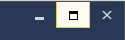
Frame: floating, unfocused
Background (Glyph)
EnvironmentRaftedWindowButtonHoverInactive
Foreground (Glyph)
Environment.RaftedWindowButtonHoverInactiveGlyph
Border (Glyph)
Environment.RaftedWindowButtonHoverInactiveBorder
Pressed
Component
Element
Token name: Category.color

Frame: floating, focused
Background (Glyph)
Environment.RaftedWindowButtonDown
Foreground (Glyph)
Environment.RaftedWindowButtonDownGlyph
Border (Glyph)
Environment.RaftedWindowButtonDownBorder
Document tabs
Document tabs sit in the tab channel to indicate which documents are currently open, along with which one is the current selected or active document. Tool windows can also be docked in the document tab channel if the user places them there. In this situation, they use the same tab colors as document windows. If you are creating UI that you want to always match the document window colors (including theme updates or if new themes are installed), then reference these color tokens.

Use … anywhere you are creating UI that you want to match document tabs and automatically pick up theme updates or new theme colors.
Do not use … for any UI that you don’t want to change automatically when the shell has a theme update.
Open document tabs
Each open document has a tab in the document tab channel that displays its name. Documents can be either selected or open in the background, and their tabs reflect these states:
The selected tab represents the document that is currently displayed in the document well. A selected tab has a document border that extends across the top edge of the document well.
Background tabs are any document tabs that are not the currently selected tab. Once clicked, they become the selected tab and acquire all background, border, and text colors from those token names.
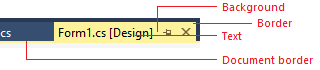
Use … when you are creating custom document tabs.
Do not use …
- for provisional (preview) tabs.
for any UI that you don't want to change automatically if the shell has a theme update.
Selected tab
Focused
Component
Element
Token name: Category.color

Selected document tab, focused
Background
Environment.FileTabSelectedGradientTop
While not used in modern themed UI, there are gradient stops and values for this background.
Foreground (Text)
Environment.FileTabSelectedText
Border
Environment.FileTabSelectedBorder
Set to same color as background.
Document border
Environment.FileTabDocumentBorderBackground
Unfocused
Component
Element
Token name: Category.color

Selected document tab, unfocused
Background
Environment.FileTabInactiveGradientTop
While not used in modern themed UI, there are gradient stops and values for this background.
Foreground (Text)
Environment.FileTabInactiveText
Border
Environment.FileTabInactiveBorder
Set to same color as background.
Document border
Environment.FileTabInactiveDocumentBorderBackground
Background tab
Default

Background tab default
Background
Environment.FileTabBackground
Foreground (Text)
Environment.FileTabText
Border
Environment.FileTabBorder
Set to same color as background.
Hover

Background tab on hover
Background
Environment.FileTabHotGradientTop
While not used in modern themed UI, there are gradient stops and values for this background.
Foreground (Text)
Environment.FileTabHotText
Border
Environment.FileTabHotBorder
Set to same color as background.
Preview tab
The preview tab appears on the right side of the document tab channel when the user clicks an item in the Solution Explorer tool window. It acts as a preview of the document and also gives the user the option to keep the document open on the left side of the document tab channel. Only one preview tab open can be open at a time. Preview tabs have both background and selected states, like open tabs, and can be focused or unfocused in their active state.
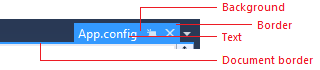
Use … anywhere you are creating provisional preview and want some element to match the current preview tab color.
Do not use …
for any kind of document or tab that is not provisional (preview).
for any UI that you don't want to change automatically if the shell has a theme update.
Selected preview tab: Focused
Component
Element
Token name: Category.color

Focused preview tab
Background
Environment.FileTabProvisionalSelectedActiveForeground (Text)
Environment.FileTabProvisionalSelectedActiveForegroundBorder
Environment.FileTabProvisionalSelectedActiveBorderSet to same color as background.
Document border
Environment.FileTabProvisionalSelectedActiveBorderSelected preview tab: Unfocused
Component
Element
Token name: Category.color

Unfocused preview tab
Background
Environment.FileTabProvisionalSelectedInactiveForeground (Text)
Environment.FileTabProvisionalSelectedInactiveForegroundBorder
Environment.FileTabProvisionalSelectedInactiveBorderDocument border
Environment.FileTabProvisionalSelectedInactiveBorderBackground preview tab: Default
Component
Element
Token name: Category.color

Preview tab background tab
Background
Environment.FileTabProvisionalInactiveForeground (Text)
Environment.FileTabProvisionalInactiveForegroundBorder
Environment.FileTabProvisionalInactiveBorderSet to same color as background.
Background preview tab: Hover
Component
Element
Token name: Category.color

Preview tab background tab on hover
Background
Environment.FileTabProvisionalHoverForeground (Text)
Environment.FileTabProvisionalHoverForegroundBorder
Environment.FileTabProvisionalHoverBorderSet to same color as background.
Document overflow button
The document overflow button is present if there are one or more documents open, regardless of whether there is vertical space in the current configuration to fit all document tabs. The document overflow drop-down menu, which is controlled by the CommandBarMenu colors (see Menus), displays a list of all open documents, both visible and hidden, and the overflow glyph changes depending on whether all the open documents are displayed in the tab channel.
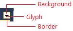
Use … when you are creating a custom document overflow button.
Do not use …
for UI that is not similar to an overflow button.
for command bar overflow buttons.
Default
Component
Element
Token name: Category.color

Document overflow button
Background
Environment.DocWellOverflowButtonBackgroundForeground (Glyph)
Environment.DocWellOverflowButtonGlyphBorder
N/A
Hover
Component
Element
Token name: Category.color

Document overflow button on hover
Background
Environment.DocWellOverflowButtonMouseOverBackgroundForeground (Glyph)
Environment.DocWellOverflowButtonMouseOverGlyphBorder
Environment.DocWellOverflowButtonMouseOverBorderPressed
Component
Element
Token name: Category.color

Pressed document overflow button
Background
Environment.DocWellOverflowButtonMouseDownBackgroundForeground (Glyph)
Environment.DocWellOverflowButtonMouseDownGlyphBorder
Environment.DocWellOverflowButtonMouseDownBorder
Tool windows
There is no need to replicate tool windows, because they are provided by the Visual Studio environment. However, you might decide that you want to leverage the colors used in tool windows so that your UI always appears consistent with this part of the Visual Studio environment.
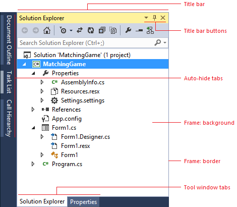
Use … anywhere you are creating UI that you want to match tool windows.
Do not use … for any UI that you don't want to change automatically if the shell has a theme update.
Tool window frame
Tool windows in Visual Studio are used for many different tasks, and can exist in one of several different states. If a tool window is open, it can be assigned to any of the four sides of the document area. Tool windows can also float outside of the IDE, which allows them to be repositioned anywhere within the user's screen. Floating windows always sit on top of the IDE. Finally, tool windows can be docked as document windows and appear as a tab in the document well. Tool windows that have been docked as document windows are colored in part using document window token names.
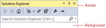
Use … anywhere you are creating UI that you want to match tool windows.
Do not use … for any UI that you don't want to change automatically if the shell has a theme update.
Docked
Component
Element
Token name: Category.color
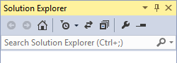
Background
Environment.ToolWindowBackground
Border
Environment.ToolWindowBorder
Floating: focused
Component
Element
Token name: Category.color
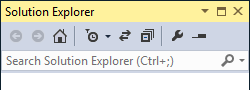
Background
Environment.ToolWindowBackground
Border
Environment.MainWindowActiveDefaultBorder
Floating: unfocused
Component
Element
Token name: Category.color
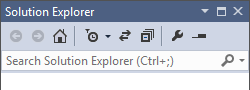
Background
Environment.ToolWindowBackground
Border
Environment.MainWindowInactiveBorder
Tool window title bar
The title bar border is not a true border, but a thick line across the top of the title bar. It does not have a token name for its unfocused state.
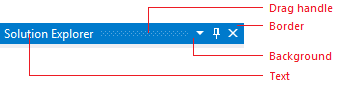
Use … anywhere you are creating UI that you want to match tool windows.
Do not use … for any UI that you don't want to change automatically if the shell has a theme update.
Focused
Component
Element
Token name: Category.color

Focused title bar
Background
Environment.TitleBarActiveGradientBegin
While not used in modern themed UI, there are gradient stops and values for this background.
Foreground (Text)
Environment.TitleBarActiveText
Border
Environment.TitleBarActiveBorder
Set to same color as background.
Drag handle
Environment.TitleBarDragHandleActive
Unfocused
Component
Element
Token name: Category.color

Unfocused title bar
Background
Environment.TitleBarInactiveGradientBegin
While not used in modern themed UI, there are gradient stops and values for this background.
Foreground (Text)
Environment.TitleBarInactiveText
Border
N/A
Drag handle
Environment.TitleBarDragHandle
Title bar buttons
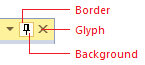
Use … for buttons that appear in UI that uses color tokens from the tool window title bars.
Do not use …
for buttons that appear in other locations.
in any background/foreground combination other than specified.
Default
Component
Element
Token name: Category.color

Focused
Background
N/A
Foreground (Glyph)
Environment.ToolWindowButtonActiveGlyphBorder
N/A

Unfocused
Background
N/A
Foreground (Glyph)
Environment.ToolWindowButtonInactiveGlyphBorder
N/A
Hover
Component
Element
Token name: Category.color

Focused
Background
Environment.ToolWindowButtonHoverActiveForeground (Glyph)
Environment.ToolWindowButtonHoverActiveGlyphBorder
Environment.ToolWindowButtonHoverActiveBorder
Unfocused
Background
Environment.ToolWindowButtonHoverInactiveForeground (Glyph)
Environment.ToolWindowButtonHoverInactiveGlyphBorder
Environment.ToolWindowButtonHoverInactiveBorderPressed
Component
Element
Token name: Category.color

Focused
Background
Environment.ToolWindowButtonDownForeground (Glyph)
Environment.ToolWindowButtonDownActiveGlyphBorder
Environment.ToolWindowButtonDownBorder
Unfocused
Background
Environment.ToolWindowButtonDownForeground (Glyph)
Environment.ToolWindowButtonDownInactiveGlyphBorder
Environment.ToolWindowButtonDownBorder
Tool window tabs
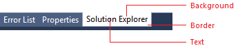
Use … anywhere you are creating UI that you want to match tool windows.
Do not use … for any UI that you don't want to change automatically if the shell has a theme update.
Selected tab
Component
Element
Token name: Category.color
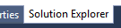
Selected, focused tool window tab
Background
Environment.ToolWindowTabSelectedTab
Foreground (Text)
Environment.ToolWindowTabSelectedActiveText
Border
Environment.ToolWindowTabSelectedBorder
Set to same color as background.
Component
Element
Token name: Category.color
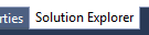
Selected, unfocused tool window tab
Background
Environment.ToolWindowTabSelectedTab
Foreground (Text)
Environment.ToolWindowTabSelectedText
Border
Environment.ToolWindowTabSelectedBorder
Set to same color as background.
Background tab
Component
Element
Token name: Category.color
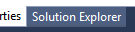
Background tool window tab
Background
Environment.ToolWindowTabGradientBegin
Gradient stops set to the same color value in Visual Studio 2013.
Environment.ToolWindowTabGradientEnd
Gradient stops set to the same color value in Visual Studio 2013.
Foreground (Text)
Environment.ToolWindowTabText
Border
Environment.ToolWindowTabBorder
Component
Element
Token name: Category.color
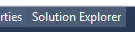
Background tool window tab on hover
Background
Environment.ToolWindowTabMouseOverBackgroundBegin
Gradient stops set to the same color value in Visual Studio 2013.
Environment.ToolWindowTabMouseOverBackgroundEnd
Gradient stops set to the same color value in Visual Studio 2013.
Foreground (Text)
Environment.ToolWindowTabMouseOverText
Border
Environment.ToolWindowTabMouseOverBorder
Set to same color as background.
Auto-hide tabs
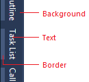
Use … anywhere you are creating UI that you want to match auto-hidden tool window tabs.
Do not use … for any UI that you don’t want to change automatically if the shell has a theme update.
Default
Component
Element
Token name: Category.color

Default auto-hide tab
Background
Environment.AutoHideTabBackgroundBegin
While not used in modern themed UI, there are gradient stops and values for this background.
Foreground (Text)
Environment.AutoHideTabText
Border
Environment.AutoHideTabBorder
Hover
Component
Element
Token name: Category.color

Auto-hide tab on hover
Background
Environment.AutoHideTabMouseOverBackgroundBegin
While not used in modern themed UI, there are gradient stops and values for this background.
Foreground (Text)
Environment.AutoHideTabMouseOverText
Border
Environment.AutoHideTabMouseOverBorder
Common shared controls
When you use a standard Visual Studio command bar in your feature, you will have access to styled shell controls, and you should not re-template these common controls. However, if you need to build a custom command bar, you might need to build custom controls as well. In that case, make sure to use the correct token names for each of the following controls so that your UI is consistent with the rest of Visual Studio.
Search box
Whenever possible, use the common search control provided by the Visual Studio environment. Search box colors are found in the "SearchControl" category in the ShellColors.pkgdef file, which contains token names for the input field, action button, drop-down button, and drop-down menu.
A search box can be one of several states, some of which are mutually exclusive:
"Focused" or "unfocused" refers to whether or not the cursor is in the text box.
"Active" or "inactive" refers to whether the user has input a search query in the text box.
"Hover" means that the user has moused over the search box with the mouse (this state overrides all other states).
"Disabled" means that search functionality is turned off for the current context.
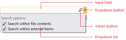
Use … when you are designing a custom search box.
Do not use …
- for anything that is not a search box.
for anything that you do not want always to match the search box UI.
Focused
Component
Element
Token name: Category.color

Input field
Background
SearchControl.FocusedBackgroundForeground (Text)
SearchControl.FocusedBackgroundBorder
SearchControl.FocusedBorderSeparator
SearchControl.FocusedDropDownSeparator
Action button
Background
None
Foreground (Search glyph)
SearchControl.SearchGlyphForeground (Stop glyph)
SearchControl.StopGlyphForeground (Clear glyph)
SearchControl.ClearGlyphBorder
N/A

Drop-down button
Background
SearchControl.FocusedDropDownButtonForeground (Glyph)
SearchControl.FocusedDropDownButtonGlyphBorder
SearchControl.FocusedDropDownButtonBorderUnfocused
Component
Element
Token name: Category.color

Active input field
Background
SearchControl.SearchActiveBackgroundForeground (Text)
SearchControl.SearchActiveBackgroundBorder
SearchControl.UnfocusedBorderSeparator
SearchControl.DropDownSeparator
Inactive input field
Background
SearchControl.UnfocusedForeground (Text)
SearchControl.UnfocusedBorder
SearchControl.UnfocusedBorderSeparator
SearchControl.DropDownSeparator
Action button
Background
N/A
Foreground (Search glyph)
SearchControl.SearchGlyphForeground (Stop glyph)
SearchControl.StopGlyphForeground (Clear glyph)
SearchControl.ClearGlyphBorder
N/A

Drop-down button
Background
SearchControl.UnfocusedDropDownButtonForeground (Glyph)
SearchControl.UnfocusedDropDownButtonGlyphBorder
SearchControl.UnfocusedDropDownButtonBorderPressed
Component
Element
Token name: Category.color

Action button
Background
SearchControl.ActionButtonMouseDownForeground (Glyph)
SearchControl.ActionButtonMouseDownGlyphBorder
SearchControl.ActionButtonMouseDownBorder
Drop-down button
Background
SearchControl.MouseDownDropDownButtonForeground (Glyph)
SearchControl.MouseDownDropDownButtonGlyphBorder
SearchControl.MouseDownDropDownButtonBorderHighlighted (Text only)
Component
Element
Token name: Category.color

Input field with text highlighted
Background
SearchControl.SelectionForeground (Text)
SearchControl.FocusedBackgroundBorder
None
Separator
SearchControl.FocusedDropDownSeparatorDisabled
Component
Element
Token name: Category.color

Input field
Background
SearchControl.DisabledForeground (Text)
SearchControl.DisabledBorder
SearchControl.DisabledBorderSeparator
SearchControl.DropDownSeparator
Action button
Background
None
Foreground (Glyph)
SearchControl.ActionButtonDisabledGlyphBorder
None

Drop-down button
Background
None
Foreground (Glyph)
SearchControl.DisabledDownButtonGlyphBorder
None
Search drop-down lists
The search box dropdown menu has the potential to be slightly more complex than other dropdown menus in Visual Studio. The "suggested searches" and "search options" sections can appear alone or together in the menu and each one is colored separately. A line also separates these two sections when they appear together and a border surrounds the entire dropdown menu.
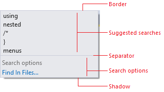
Use …
when you are creating a custom search dropdown list.
the correct token names for the correct list components.
Do not use …
- for dropdown lists that appear in other contexts.
in any background/foreground combination other than specified.
Default (no other states)
Element
Token name: Category.color
Border
SearchControl.PopupBorderSeparator
SearchControl.PopupSectionHeaderSeparatorShadow
Environment.DropShadowBackgroundDefault
Component
Element
Token name: Category.color
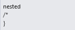
Suggested searches
Background
SearchControl.PopupItemsListBackgroundGradientBeginWhile not used in modern themed UI, there are gradient stops and values for this background.
Foreground (Text)
SearchControl.PopupItemText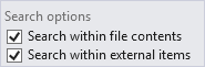
Search options (check box)
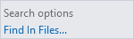
Search options (link)
Background
SearchControl.PopupSectionBackgroundGradientBeginWhile not used in modern themed UI, there are gradient stops and values for this background.
Foreground (Check box text)
SearchControl.PopupCheckboxTextForeground (Link text)
SearchControl.PopupButtonTextHeader background
SearchControl.PopupSectionHeaderGradientBeginWhile not used in modern themed UI, there are gradient stops and values for this background.
Foreground (Header text)
SearchControl.PopupSectionHeaderTextHover
Component
Element
Token name: Category.color
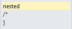
Suggested searches
Background
SearchControl.PopupControlMouseOverBackgroundGradientBeginWhile not used in modern themed UI, there are gradient stops and values for this background.
Foreground (Text)
SearchControl.PopupMouseOverItemTextBorder
SearchControl.PopupControlMouseOverBorder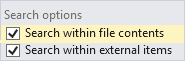
Suggested searches (check box)
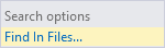
Search options
Background
SearchControl.PopupControlMouseOverBackgroundGradientBeginWhile not used in modern themed UI, there are gradient stops and values for this background.
Foreground (Check box text)
SearchControl.PopupCheckboxMouseDownTextForeground (Link text)
SearchControl.PopupButtonMouseDownTextBorder
SearchControl.PopupControlMouseOverBorderPressed
Component
Element
Token name: Category.color
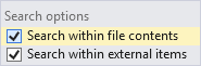
Suggested searches (check box)
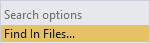
Search options
Check box background
SearchControl.PopupControlMouseDownBackgroundGradientBeginWhile not used in modern themed UI, there are gradient stops and values for this background.
SearchControl.PopupControlMouseDownBackgroundGradientEndWhile not used in modern themed UI, there are gradient stops and values for this background.
Foreground (Check box text)
SearchControl.PopupCheckboxMouseDownTextLink background
SearchControl.PopupButtonMouseDownBackgroundGradientBeginWhile not used in modern themed UI, there are gradient stops and values for this background.
Foreground (Link text)
SearchControl.PopupButtonMouseDownText
Hyperlink
The hyperlink is one control that does not have a foreground/background pair. In all cases, use the foreground hyperlink color, which will appear correctly on dark, gray and white backgrounds. If you do not use the color token for the hyperlink control, you will see the default system color for "pressed,"" which will flash red. That is the signal that the control is not using the correct environment color token.

Use … when you need to create a custom hyperlink.
Do not use … for anything that is not a hyperlink.
Default
Component
Element
Token name: Category.color
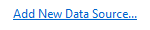
Foreground (Text)
Environment.PanelHyperlink
Hover
Component
Element
Token name: Category.color
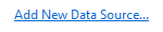
Foreground (Text)
Environment.PanelHyperlinkHover
Pressed
Component
Element
Token name: Category.color
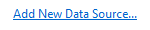
Foreground (Text)
Environment.PanelHyperlinkPressed
Disabled
Component
Element
Token name: Category.color
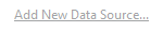
Foreground (Text)
Environment.PanelHyperlinkDisabled
Infobar
Infobars are used to provide more information about a given context and always appear at the top of a document window or tool window.

Use … when creating custom infobars.
Do not use … for UI elements that are not similar to an infobar.
Component
Element
Token name: Category.color

Infobar
Background
Environment.InfoBackground
Foreground (Text)
Environment.InfoText
Border
Environment.ToolWindowBorder
Scroll bar
Scroll bars are styled by the Visual Studio environment, and will not need to be themed. However, you might decide that you want to leverage the colors used in scroll bars so that your UI always appears consistent with this part of the Visual Studio environment.
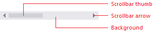
Use … when you are creating UI that you want to match Visual Studio scrollbars.
Do not use ... for anything you don't want to always match scrollbar UI.
Default
Component
Element
Token name: Category.color

Scrollbar
Scrollbar
Environment.ScrollBarBackground
Foreground (Thumb)
Environment.ScrollBarThumbBackground

Scroll arrow
Background
Environment.ScrollBarArrowBackground
Set to same color as scroll bar.
Foreground (Glyph)
Environment.ScrollBarArrowGlyph
Hover
Component
Element
Token name: Category.color

Scrollbar
Scrollbar
Environment.ScrollBarBackground
Foreground (Thumb)
Environment.ScrollBarThumbMouseOverBackground

Scroll arrow
Background
Environment.ScrollBarArrowMouseOverBackground
Set to same color as scroll bar.
Foreground (Glyph)
Environment.ScrollBarArrowGlyphMouseOver
Pressed
Component
Element
Token name: Category.color

Scrollbar
Scrollbar
Environment.ScrollBarBackground
Foreground (Thumb)
Environment.ScrollBarThumbPressedBackground

Scroll arrow
Background
Environment.ScrollBarArrowPressedBackground
Set to same color as scrollbar.
Foreground (Glyph)
Environment.ScrollBarArrowGlyphPressed
Tree view
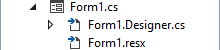
Several tool windows, including the Solution Explorer, Server Explorer, and Class View, implement a hierarchical organizational scheme whose colors are controlled by color names in the TreeView category. All items in a tree view have background and text colors. Items that have nested child elements also have glyphs that indicate whether the item is expanded or collapsed.
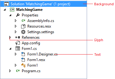
Use … anywhere you need to implement a hierarchical organizational view.
Do not use …
for anything that is not similar to a tree view.
in any background/foreground combination other than specified.
Default
Component
Element
Token name: Category.color
Background
TreeView.BackgroundForeground (Text)
TreeView.BackgroundForeground (Glyph)
TreeView.GlyphBorder
None
Hover
Component
Element
Token name: Category.color
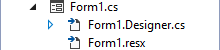
Background
TreeView.BackgroundForeground (Text)
TreeView.BackgroundForeground (Glyph)
TreeView.GlyphMouseOverBorder
None
Drag over
Component
Element
Token name: Category.color
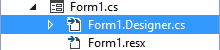
Background
TreeView.DragOverItemForeground (Text)
TreeView.DragOverItemForeground (Glyph)
TreeView.DragOverItemGlyphBorder
None
Selected
Component
Element
Token name: Category.color
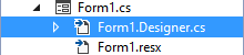
Focused
Background
TreeView.SelectedItemActiveForeground (Text)
TreeView.SelectedItemActiveForeground (Glyph)
TreeView.SelectedItemActiveGlyphBorder
TreeView.FocusVisualBorder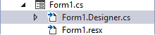
Unfocused
Background
TreeView.SelectedItemInactiveForeground (Text)
TreeView.SelectedItemInactiveForeground (Glyph)
TreeView.SelectedItemInactiveGlyphBorder
None
Hover over selected
Component
Element
Token name: Category.color
Focused
Background
TreeView.SelectedItemActiveForeground (Text)
TreeView.SelectedItemActiveForeground (Glyph)
TreeView.SelectedItemActiveGlyphMouseOverBorder
None
TreeView.FocusVisualBorder
Unfocused
Background
TreeView.SelectedItemInactiveForeground (Text)
TreeView.SelectedItemInactiveForeground (Glyph)
TreeView.SelectedItemActiveGlyphMouseOverBorder
None
Button controls
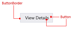
Use … for buttons in the document well that you want to integrate with Visual Studio themes (Light, Dark, Blue, or a system High Contrast theme).
Do not use … for buttons that will display against a custom background that is not part of a Visual Studio theme.
Default
Component
Element
Token name: Category.color
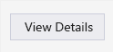
Button
CommonControls.Button
Button border
CommonControls.ButtonBorder
Disabled
Component
Element
Token name: Category.color
Button
CommonControls.ButtonDisabled
Button border
CommonControls.ButtonBorderDisabled
Hover
Component
Element
Token name: Category.color
Button
CommonControls.ButtonHover
Button border
CommonControls.ButtonBorderHover
Pressed
Component
Element
Token name: Category.color
Button
CommonControls.ButtonPressed
Button border
CommonControls.ButtonBorderPressed
Focused
Component
Element
Token name: Category.color
Button
CommonControls.ButtonFocused
Button border
CommonControls.ButtonBorderFocused
Check box controls
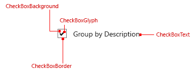
Use … for check box controls contained within the document well.
Do not use … for any UI that is not a check box control.
Default
Component
Element
Token name: Category.color
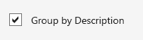
Background
CommonControls.CheckBoxBackground
Border
CommonControls.CheckBoxBorder
Text
CommonControls.CheckBoxText
Glyph
CommonControls.CheckBoxGlyph
Disabled
Component
Element
Token name: Category.color
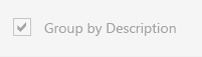
Background
CommonControls.CheckBoxBackgroundDisabled
Border
CommonControls.CheckBoxBorderDisabled
Text
CommonControls.CheckBoxTextDisabled
Glyph
CommonControls.CheckBoxGlyphDisabled
Hover
Component
Element
Token name: Category.color
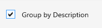
Background
CommonControls.CheckBoxBackgroundHover
Border
CommonControls.CheckBoxBorderHover
Text
CommonControls.CheckBoxTextHover
Glyph
CommonControls.CheckBoxGlyphHover
Pressed
Component
Element
Token name: Category.color
Background
CommonControls.CheckBoxBackgroundPressed
Border
CommonControls.CheckBoxBorderPressed
Text
CommonControls.CheckBoxTextPressed
Glyph
CommonControls.CheckBoxGlyphPressed
Focused
Component
Element
Token name: Category.color
Background
CommonControls.CheckBoxBackgroundFocused
Border
CommonControls.CheckBoxBorderFocused
Text
CommonControls.CheckBoxTextFocused
Glyph
CommonControls.CheckBoxGlyphFocused
Drop box/combo box controls
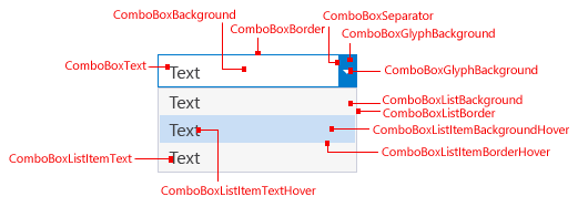
Use … for drop-downs and combo boxes that are part of the document well.
Do not use …
for any UI that is not a drop-down or combo box.
for a Drop-down or Combo box in the command bar.
Default
Component
Element
Token name: Category.color
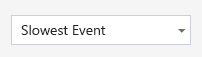
Background
CommonControls.ComboBoxBackgroundBorder
CommonControls.ComboBoxBorderText
CommonControls.ComboBoxTextSeparator
CommonControls.ComboBoxSeparatorGlyph
CommonControls.ComboBoxGlyphGlyph background
CommonControls.ComboBoxGlyphBackgroundDisabled
Component
Element
Token name: Category.color
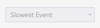
Background
CommonControls.ComboBoxBackgroundDisabledBorder
CommonControls.ComboBoxBorderDisabledText
CommonControls.ComboBoxTextDisabledSeparator
CommonControls.ComboBoxSeparatorDisabledGlyph
CommonControls.ComboBoxGlyphDisabledGlyph background
CommonControls.ComboBoxGlyphBackgroundDisabledHover
Component
Element
Token name: Category.color
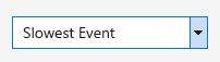
Background
CommonControls.ComboBoxBackgroundHoverBorder
CommonControls.ComboBoxBorderHoverText
CommonControls.ComboBoxTextHoverSeparator
CommonControls.ComboBoxSeparatorHoverGlyph
CommonControls.ComboBoxGlyphHoverGlyph background
CommonControls.ComboBoxGlyphBackgroundHoverPressed
Component
Element
Token name: Category.color
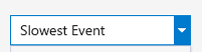
Background
CommonControls.ComboBoxBackgroundPressedBorder
CommonControls.ComboBoxBorderPressedText
CommonControls.ComboBoxTextPressedSeparator
CommonControls.ComboBoxSeparatorPressedGlyph
CommonControls.ComboBoxGlyphPressedGlyph background
CommonControls.ComboBoxGlyphBackgroundPressedFocused
Component
Element
Token name: Category.color
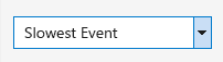
Background
CommonControls.ComboBoxBackgroundFocusedBorder
CommonControls.ComboBoxBorderFocusedText
CommonControls.ComboBoxTextFocusedSeparator
CommonControls.ComboBoxSeparatorFocusedGlyph
CommonControls.ComboBoxGlyphFocusedGlyph background
CommonControls.ComboBoxGlyphBackgroundFocusedText input selection
Component
Element
Token name: Category.color
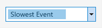
Highlight
CommonControls.ComboBoxTextInputSelectionPressed – List item view
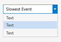
Background
CommonControls.ComboBoxListBackgroundCommonControls.ComboBoxListBackgroundHoverCommonControls.ComboBoxListItemBackgroundPressedCommonControls.ComboBoxListItemBackgroundFocusedBorder
CommonControls.ComboBoxListBorderCommonControls.ComboBoxListBorderHoverCommonControls.ComboBoxListBorderPressedCommonControls.ComboBoxListBorderFocusedItem text
CommonControls.ComboBoxListItemTextCommonControls.ComboBoxListItemTextHoverCommonControls.ComboBoxListItemTextPressedCommonControls.ComboBoxListItemTextFocusedBackground shadow
CommonControls.ComboBoxListBackgroundShadow
Tabular data (grid) controls
Tabular data controls, also known as grid controls, are common controls for Visual Studio that can be used to present large amounts of data in multiple columns. Standard tabular data controls can be found in multiple places within Visual Studio: the Error List tool window, IntelliTrace reports, and memory heap view, among others. Always use the standard tabular data controls provided. In some rare instances, you might not have access to the standard tabular data controls. In these situations, use the following token names to ensure that your UI is consistent with other tabular data controls in Visual Studio.
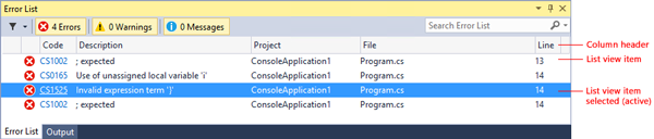
Use … for tabular or grid controls.
Do not use … for any UI that is not a tabular or grid control.
Column headers
Column headers consist of a background, a border, the title text, and an optional glyph usually used when a grid is sorted by that column.
State
Element
Token name: Category.color
Default
Background
Header.Default
Foreground (Text)
Environment.CommandBarTextActive
Foreground (Glyph)
Header.Glyph
Border
Header.SeparatorLine
Hover
Background
Header.MouseOver
Foreground (Text)
Environment.CommandBarTextHover
Foreground (Glyph)
Header.MouseOverGlyph
Border
Header.SeparatorLine
Pressed
Background
CommonControls.CheckBoxBackgroundPressed
Foreground (Text)
CommonControls.CheckBoxBorderPressed
Foreground (Glyph)
CommonControls.CheckBoxTextPressed
Border
CommonControls.CheckBoxGlyphPressed
List view items
List view items consist of a background and the content. The content can be text, an icon, or both.
State
Element
Token name: Category.color
Default
Background
Transparent
Foreground (Text)
Environment.CommandBarTextActive
Border
None
Selected (active)
Background
TreeView.SelectedItemActive
Foreground (Text)
TreeView.SelectedItemActiveText
Border
None
Selected (inactive)
Background
TreeView.SelectedItemInactive
Foreground (Text)
TreeView.SelectedItemInactiveText
Border
None
Manifest Designer
The Manifest Designer was designed as a way to make it easier to edit the manifest file in Windows 8 and Windows Phone 8 projects. While there is no shared framework available for consumption, it might be appropriate for you to match the design layout and colors of the orientation/navigation tabs and overall structure. For more information about layout details, see Layout for Visual Studio.
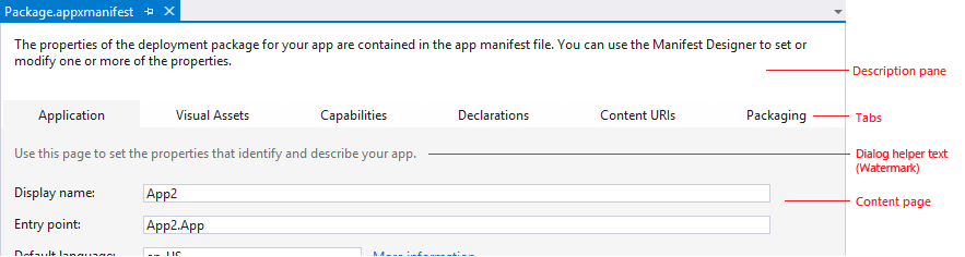
Use …
for designers that are similar to the Manifest Designer.
in place of using common tab controls at the top of an editor within the document well.
Do not use …
if you have more than six tabs.
for any UI that is not structured like the Manifest Designer.
State
Component
Element
Token name: Category.color
Default (selected)
Tab
Background
ManifestDesigner.TabActiveBorder
None
Description pane
Background
ManifestDesigner.DescriptionPaneContent page
Background
ManifestDesigner.BackgroundDialog helper text
ManifestDesigner.WatermarkTextThis token name does not match its function.
Non-selected
Tab
Background
ManifestDesigner.Tab.InactiveHover
Tab
Background
ManifestDesigner.Tab.Mouseover
Tagging
Visual Studio supports tagging, which allows a user to declare searchable keywords for tracking purposes. For example, project managers and developers can use Team Foundation Server (TFS) to tag work items. The tables below give color names for both the tag itself and the "close icon" glyph that appears in hover and selected states.

Use … for UI that supports tagging.
Do not use … for any other type of UI.
Tag
Component
Element
Token name: Category.color

Default
Background
Tag.Background
Foreground (Text)
Tag.Background

Hover
Background
Tag.HoverBackground
Foreground (Text)
Tag.HoverBackgroundText

Pressed
Background
Tag.PressedBackground
Foreground (Text)
Tag.PressedBackgroundText

Selected
Background
Tag.SelectedBackground
Foreground (Text)
Tag.SelectedBackgroundText
Glyph (close icon)
Default
Component
Element
Token name: Category.color

Default (tag default)
Background
N/A
Foreground (Glyph)
Tag.TagHoverGlyph
Hover
Component
Element
Token name: Category.color

Hover (tag default)
Background
Tag.TagHoverGlyphHoverBackground
Foreground (Glyph)
Tag.TagHoverGlyphHover
Border
Tag.TagHoverGlyphHoverBorder
Pressed
Component
Element
Token name: Category.color
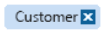
Pressed (tag default)
Background
Tag.TagHoverGlyphPressedBackground
Foreground (Glyph)
Tag.TagHoverGlyphPressed
Border
Tag.TagHoverGlyphPressedBorder
Tag selected/glyph default
Component
Element
Token name: Category.color

Default (tag selected)
Background
N/A
Foreground (Glyph)
Tag.TagSelectedGlyph
Tag selected/glyph hover
Component
Element
Token name: Category.color

Hover (tag selected)
Background
Tag.TagSelectedGlyphHoverBackground
Foreground (Glyph)
Tag.TagSelectedGlyphHover
Border
Tag.TagSelectedGlyphHoverBorder
Tag selected/glyph pressed
Component
Element
Token name: Category.color

Pressed (tag selected)
Background
Tag.TagSelectedGlyphPressedBackground
Foreground(Glyph)
Tag.TagSelectedGlyphPressed
Border
Tag.TagSelectedGlyphPressedBorder
Shell
Background
The environment background consists of two layers. The bottom layer is a solid color that covers the entire IDE. The top layer fits under the command shelf and between the tool window auto-hide channels on the left and right edges of the IDE. As of Visual Studio 2013, the top and bottom background layers are set to the same color in the Light and Dark themes.
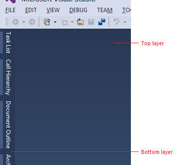
Use … for places that you want to match the background of the Visual Studio environment.
Do not use …
as a fill for places that are not background surfaces.
as a background on which you wish to place foreground elements.
Component
Element
Token name: Category.color
Bottom layer
Background
Environment.EnvironmentBackgroundComponent
Element
Token name: Category.color
Top layer
Background
Gradient stops set to the same color value in Visual Studio 2013 Light and Dark themes.
Environment.EnvironmentBackgroundGradientBeginEnvironment.EnvironmentBackgroundGradientEndEnvironment.EnvironmentBackgroundGradientMiddle1Environment.EnvironmentBackgroundGradientMiddle2
Command shelf
Two sets of token names are used for the command shelf backgrounds: one set for where the menu bar sits and one for where the command bars sit. An individual command bar group has its own background color values, which are discussed in more detail in the "command bar" section. Menu bar and command bar text is discussed in the menu and command bar sections, respectively.

Use …
for areas where you place menus or toolbars.
with the correct background/?foreground token name combination.
Do not use … for areas that are not similar to a command shelf.
Component
Element
Token name: Category.color
Menu bar
Background
Gradient stops set to the same color value in Visual Studio 2013 Light and Dark themes.
Environment.CommandShelfHighlightGradientBegin
Environment.CommandShelfHighlightGradientMiddle
Environment.CommandShelfHighlightGradientEnd
Command bar
Background
Gradient stops set to the same color value in Visual Studio 2013 Light and Dark themes.
Environment.CommandShelfBackgroundGradientBegin
Environment.CommandShelfBackgroundGradientMiddle
Environment.CommandShelfBackgroundGradientEnd
Toolbox
The toolbox is one of the common tool windows that is most frequently used in Visual Studio. It is essentially a tree control with a special theme and styling applied.
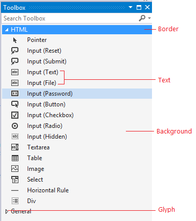
Use … when you are designing a tool window that you want to always be consistent with the shell toolbox.
Do not use … for anything that is not similar to the toolbox UI, or if you are unsure whether your UI will have problems if the shell toolbox colors change.
Default
Component
Element
Token name: Category.color
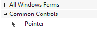
Parent node
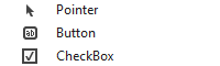
Child node
Background
Environment.ToolboxContent
Headings
Environment.ToolWindowBackground
Individual items, or entire window if no available controls
Border
None
Foreground (Glyph)
Environment.ToolboxContent
Foreground (Text)
Environment.ToolboxContent
Hover
Component
Element
Token name: Category.color
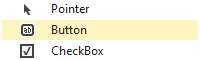
Toolbox hover on child node
Background
Environment.ToolboxContentMouseOver
Individual items only
Border
None
Foreground (Text)
Environment.ToolboxContentMouseOver
Individual items only
Selected
Component
Element
Token name: Category.color
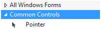
Focused parent node
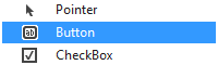
Focused child node
Background
TreeView.SelectedItemActive
From Tree view category
Border
TreeView.FocusVisualBorder
From Tree view category
Foreground (Glyph)
TreeView.SelectedItemActive
From Tree view category
Foreground (Text)
TreeView.SelectedItemActive
From Tree view category
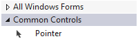
Unfocused parent node
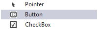
Unfocused child node
Background
TreeView.SelectedItemInactive
From Tree view category
Border
None
Foreground (Glyph)
TreeView.SelectedItemInactive
From Tree view category
Foreground (Text)
TreeView.SelectedItemInactive
From Tree view category