Ways of working assessment
Important
This article is for the legacy Workplace Analytics app and does not reflect functionality available on the updated Viva Insights platform. Access current documentation for Viva Insights advanced insights here: advanced insights documentation.
The Ways of working assessment dashboard uses a template that’s populated by Viva Insights data to conduct a broad diagnostic of a company’s collaboration culture and employee experience. It is designed to highlight collaboration patterns for different groups and organizational levels and to identify opportunities for improvements.
The different pages in the report help you answer the following related questions:
Collaboration culture
- How is collaboration load impacting after-hours?
- How much time do people spend in different collaboration channels?
- How does the organization spend its meeting time?
- How much time is going toward long or large meetings?
- Who in the organization is generating the most workload by organizing meetings?
- Can employees reclaim focus time through ‘compact’ scheduling practices?
- Is multitasking during meetings driven by habit or by necessity?
- Which recurring meetings might present streamlining opportunities?
- Are there opportunities to drive greater agility in emailing practices?
Employee experience
- When does collaboration start impacting after-hours workload?
- Who in the organization is at highest risk of burnout?
- Is manager double-booking creating potential ripple effects across the company?
- Are employees receiving sufficient 1:1 coaching time?
- Are managers balancing oversight with employee empowerment and autonomy?
- What managerial behaviors predominate across the company and by organization?
Each report includes a What to examine and Why it matters interpretation that explains how to analyze the data to answer the business questions and how to use best practices to maintain or improve company collaboration patterns and employee experience.
To populate the dashboard in Power BI, you must set up and successfully run the predefined Ways of working assessment and Standard meeting query in Viva Insights.
After you successfully run these queries, you can download the template from the Ways of working assessment query on the Results page. After you download the template, you can then connect the query data from Viva Insights to the dashboard in Power BI.
Note
The template and dashboard name has been changed from Collaboration assessment to Ways of working assessment.
Demonstration
The following demo uses sample data that is only representative of this dashboard and might not be exactly what you see in a live dashboard specific to your organization's unique data.
To find the template for the Ways of working assessment dashboard, go to the Query designer (If that link doesn't work, try this link instead.) For complete steps, see Set up the dashboard.
Prerequisites
Before you can run the queries and populate the dashboard in Power BI, you must:
- Be assigned the role of Analyst in the advanced insights app.
- Have the latest version of Power BI Desktop installed. If you have an earlier version of Power BI installed, uninstall it before installing the new version. Then go to Get Power BI Desktop to download and install the latest version.
Set up the dashboard
Note
This dashboard is currently only available in English and will only work with data generated from the English version of the app. Before running the required queries, confirm the browser language in the app's URL includes en-us, or change it to include en-us: ...office.com/en-us/...
In the app(if that link doesn't work, try this link instead), select Analyze > Query designer.
In Create > Featured templates, select Ways of working assessment to see the required setup steps, and then in step 2, select Set up.
When prompted, confirm the following settings:
- Name - Customize or keep the default name
- Group by - Week
- Time period - Select the time period you want to analyze
- Auto-refresh - Leave this setting disabled because this template is not designed to track metrics over time
- Meeting exclusions - Select the preferred rule for your tenant
Important
If you try to delete a predefined metric, you'll see a warning that the deletion might disable portions of the Power BI dashboard and reduce query results. In turn, this can limit your ability to visualize collaboration patterns. Depending on the metric you delete, you might disable a single Power BI chart, several charts, or all the charts. Select Cancel to retain the metric.
In Select filters, select Active only for Which measured employees do you want to include? Optionally, you can further filter the employees in scope for the dashboard. For more details about filter and metric options, see Create a Person Query.
In Organizational data, keep the preselected Organization and LevelDesignation attributes that the dashboard requires.
Important
LevelDesignation is a reserved optional attribute when uploading your organizational data. If this attribute was not uploaded and is unavailable in the advanced insights app, charts and data relating to LevelDesignation will not show in the query output or in Power BI reports.
You must then locate and select the organizational attribute that identifies people managers in your company (those who have employees who report to them directly or indirectly) as opposed to individual contributors (ICs). Because this field is not a required organizational attribute, your organization might not have included it when setting up the advanced insights app. If you cannot find the field in the drop-down menu, contact your Viva Insights admin to confirm whether the field was included in the Organizational HR data file and made available in the query output.
Important
You can still set up the dashboard without the people manager attribute. However, some of the Power BI charts and filtering capabilities will be disabled.
You can then select any additional attributes (columns) that you want to include in the reports.
Select Run to run the query, which can take a few minutes to complete.
When prompted, select to return to the Query designer and run the Ways of working meeting query to get the meeting metrics for the dashboard.
Select or confirm the following query settings:
- Name - Customize or keep the default name
- Time period – Select the time period you want to analyze; it should match the one you selected in the Ways of working assessment query.
- Auto-refresh – Leave this setting disabled because this template is not designed to track metrics over time
- Meeting exclusions - Select the preferred rule for your tenant
Important
If you try to delete a predefined metric, you'll see a warning that the deletion might disable portions of the Power BI dashboard and reduce query results. In turn, this can limit your ability to visualize collaboration patterns. Depending on the metric you delete, you might disable a single Power BI chart, several charts, or all the charts. Select Cancel to retain the metric.
Optionally, you can add filters to limit the list of meetings included in the output file. To learn more about meeting filters, see Add filters for meeting queries. You can also customize the metrics to focus on a specific organization (or any other organizational attribute). To learn more about custom metrics, see Add custom metrics in a meeting query.
Important
If you filtered the Ways of working assessment query to focus on a specific organization (or any other organizational attribute), you must customize the metrics for this Standard meeting query to reflect the same population.
In Organizational data, keep the preselected IsRecurring, Subject, and DurationHours attributes that the dashboard requires.
Important
If you remove the required, preselected Organizational data attributes, you might disable one or more Power BI charts.
You can then select any additional attributes (columns) that you want to include in the reports.
Select Run to run the query, which can take a few minutes to complete.
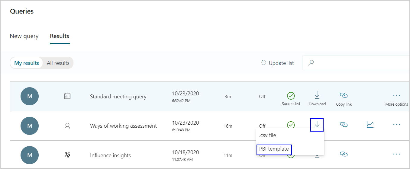
When prompted, continue to Results. After both queries successfully run, select the Download icon for the Ways of working assessment query results, select PBI template, and then select OK to download the template.

Open the downloaded Ways of working assessment template.
If prompted to select a program, select Power BI.
When prompted by Power BI, copy and paste the OData links for both queries into their respective fields.
- In Query designer > Results page, select the Link icon for each query, and select to copy the generated OData URL link.
- In Power BI, paste each copied link into its respective field.
- Set the Minimum group size for data aggregation within this report's visualizations in accordance with your company's policy for viewing Viva Insights data.
- In SupervisorIndicator field, enter the exact name of the organizational attribute that you selected in Step 6, which designates who in the organization is a people manager. If your organization has not uploaded this field in the organization data file, you don’t have to complete this field. However, some visuals and filtering capabilities will be disabled.
- Select Load to import the query results into Power BI. Loading these large files may take some time to complete.
If you're already signed in to Power BI with your Viva Insights organizational account, the dashboard visualizations will populate with your data. You are done and can skip the following steps. If not, proceed to the next step.
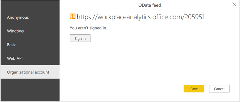
If you're not signed in to Power BI, or if an error occurs when updating the data, sign in to your organizational account again. In the OData feed dialog box, select Organizational account, and then select Sign in. See Troubleshooting for more details.

Select and enter credentials for the organizational account that you use to sign in to Viva Insights, and then select Save.
Important
You must sign in to Power BI with the same account you use to access Viva Insights.
Select Connect to prepare and load the data, which can take a few minutes to complete.
Dashboard settings
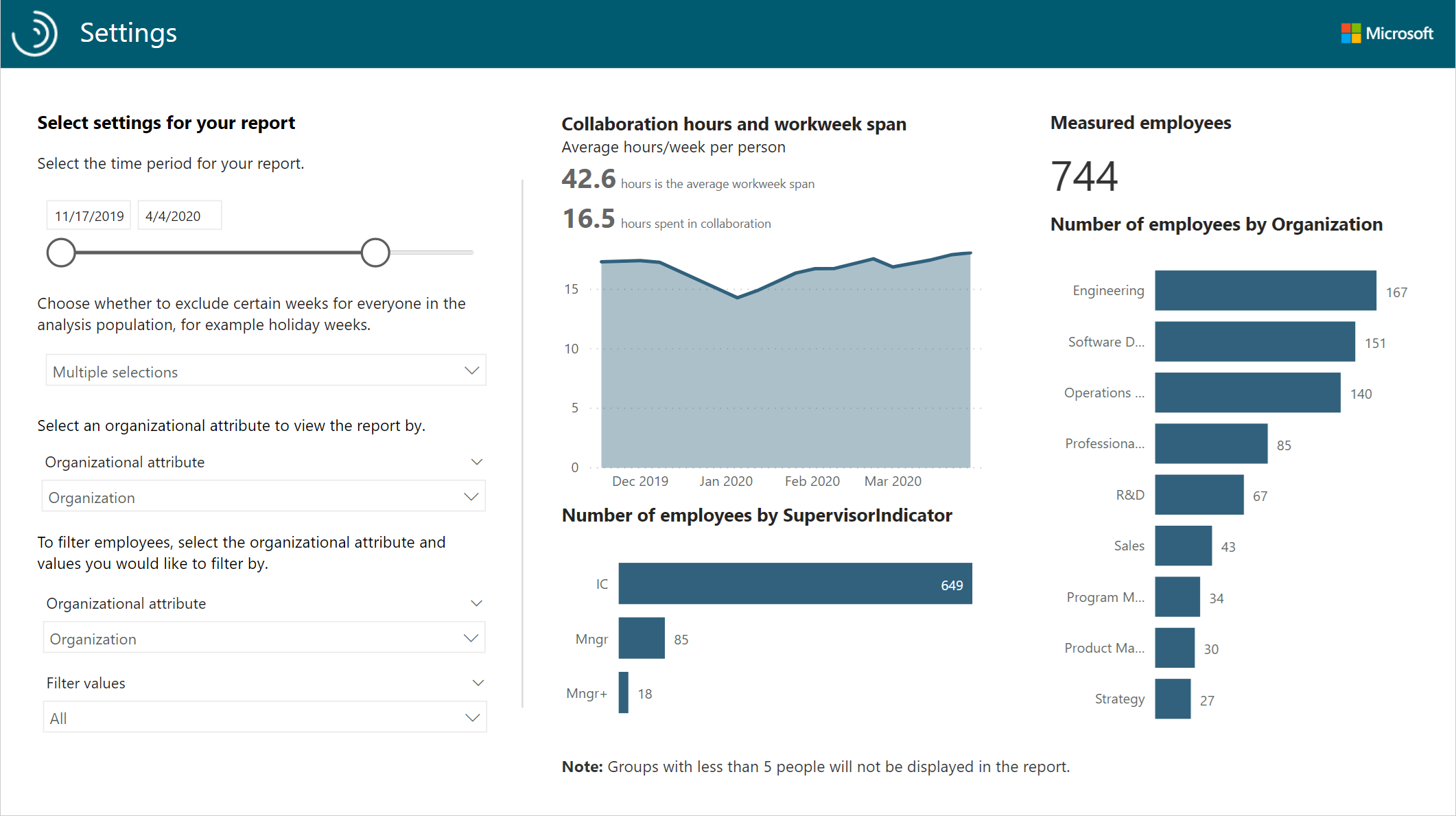
After the Ways of working assessment dashboard is set up and populated with Viva Insights data in Power BI, as a first step to viewing data in the dashboard, view and set the following parameters on the Settings page.
- Time period - This is the time period that you want to analyze.
- Exclude specific weeks – You can select one or more weeks to exclude from analysis, such as those that include company holidays.
- Organizational attribute to view the report by - The primary “group-by” attribute shown in all subsequent reports. You can change this attribute at any time and all subsequent report pages will show group values by the new attribute.
- Organizational attribute to filter by – To filter the measured employee population, you can filter by any selected Organizational attribute, and then filter by any of the values for these attributes. If you use filters, the measured employees count will reflect a reduced number. Measured employees reflect the number of employees in the filtered population who were active during the specified time period. Active employees are those who sent at least one email or instant message during a work week included in the current time period.
Important
The filters selected in Settings apply to all but one of the reports. The Meeting engagement report is the exception. To focus on a specific organization in that report, you must customize the metrics in the Standard meeting query, as described in Step 11 of Set up the dashboard.
After confirming the settings, check the number of measured employees to confirm this is the population you want to analyze.

Employees with low collaboration
By default, this dashboard excludes employees who spent a weekly average of less than five hours in meetings, email, instant messages, and calls because they are likely non-knowledge workers or they do not use Outlook or Teams.
The dashboard also excludes unusually low collaboration weeks based on individual collaboration patterns. These low collaboration weeks usually occur when employees are taking time off from work.
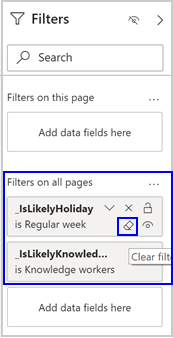
If you want to include employees with low collaboration in your analysis, select the Clear filter (eraser) icon to clear the IsLikelyKnowledgeWorker and IsLikelyHoliday filters in the Power BI Filters pane.

About the reports
The Ways of working assessment dashboard includes the following report pages that help you assess your company's collaboration culture and employee experience.
Collaboration culture
- Collaboration and after-hours – Shows the average weekly collaboration hours for each person by organization as compared to after-hours collaboration and the percentage of a standard 40-hour workweek spent in collaboration. This highlights how collaboration load is impacting after-hours work.
- Collaboration modes – Shows the average weekly hours spent in meetings, email, chats and unscheduled calls for each person by organization as compared to after-hours activity. Understanding differences between how teams get work done can uncover both replicable best practices and areas of opportunity.
- Meeting culture – Shows the percentage of time spent in the different meeting types by attendees and duration. This highlights how the organization spends its meeting time. Large or long recurring meetings are easy candidates to streamline by reducing the number of attendees or the meeting frequency or duration.
- Long or large meetings – Shows the percentage of meeting time spent in large or long meetings by organization. Analyzing meeting practices at the organizational level can help pinpoint sources of meeting overload to streamline or those organizations with successful meeting best practices that could be replicated across the company.
- Generated workload – Shows the distribution of employees by the number of meeting hours each employee generated by organizing meetings. This highlights who in the organization is generating the most workload by organizing meetings.
- Fragmentation – Shows the fragmented hours as compared to the number of meetings that employees attend weekly. This information can help you guide employees to reclaim important focus time through compact meeting scheduling practices.
- Multitasking – Shows the distribution of employees by their average collaboration hours and average multitasking rate. This analysis helps determine if multitasking rates during meetings are a function of habit or a consequence of lacking enough free time during the workday to catch up on email outside of meetings.
- Meeting engagement – Shows recurring meetings by meeting impact and meeting engagement and lists the top 20 low engagement recurring meetings. This highlights which recurring meetings are good candidates to streamline by reducing the number of attendees or the meeting cadence or duration.
- Email load – Shows the distribution of emails sent based on the number of recipients of each email. It also shows the percentages of these email categories sent by employees in each organization. This information can help your organization drive greater agility in emailing practices.
Employee experience
After-hours pressure – Shows the average number of after-hours collaboration hours per week as a function of total time spent on collaboration and highlights if and when weekly collaboration starts impacting after-hours workload.
Burnout risk – Shows the distribution of employees by collaboration hours and workweek span, which helps you identify who in the organization is at highest risk of burnout.
Double-booking – Shows the distribution of managers by meeting hours and the percentage of double-booked manager time in meetings. This highlights how double-booked meetings have downstream impacts that hinder organizational agility.
Important
To filter for manager data only, you must select all manager groups in the SupervisorIndicator at the upper right of the page.
Manager 1:1 time & frequency – Shows the distribution of employees by how much weekly 1:1 time they get with their managers and the frequency of these meetings. This highlights if employees are getting enough 1:1 manager coaching.
Co-attendance – Shows the percentage of employees who spend more than 30 percent of their meeting time in meetings where their manager is also present. This highlights if managers are balancing oversight with employee empowerment and autonomy. However, it’s important to account for any expectations and norms unique to your company when analyzing the data across the different groups.
Important
To filter for manager data only, you must select all manager groups in the SupervisorIndicator at the upper right of the page.
Manager relationship – Shows the distribution of employees attending the same meetings as their managers and their average weekly 1:1 meeting time with their managers, which is compared across the company. It also analyzes different segments of manager behaviors based on their rates of attending the same meeting as their employees and their 1:1 meeting time.
The dashboard also includes a Glossary page that describes all the report metrics.
Training opportunity
Learn how to use this template to evaluate collaboration culture and employee experience: Analyze collaboration and engagement using the Ways of working assessment dashboard
Power BI tips, FAQs, and troubleshooting
For details about how to share the dashboard and other Power BI tips, troubleshoot any issues, or review the FAQ, see Power BI tips, FAQ, and troubleshooting.