Note
Access to this page requires authorization. You can try signing in or changing directories.
Access to this page requires authorization. You can try changing directories.
Note
This report was updated on March 18, 2026.
The Microsoft 365 Copilot adoption report provides a broad analysis of how Microsoft 365 Copilot is being adopted throughout your organization, as shown on the Adoption overview page. On the Power users page (the report's second tab), you can pinpoint teams that frequently use Copilot and discover how they use it in their daily work. At the top of each reporting page, you can use filters to narrow down information or organize data by any organizational attribute. The interactive charts let you filter or cross-highlight details across different visuals for deeper insights.
Demonstration
The following demonstration uses sample data that’s only representative of this report and might not be exactly what you see in a live report specific to your organization's unique data.
Prerequisites
Before you can run the queries and populate the report in Power BI, you'll need to:
- Be assigned the role of Insights Analyst in Viva Insights.
- Have Power BI Desktop installed. Use a current version of Power BI Desktop. If you have an earlier version installed, uninstall it before installing the newer version. Then go to Get Power BI Desktop to download and install the latest version.
- Have licenses assigned to the employees you would like to include as part of your measured population: Microsoft 365 Copilot licenses or Microsoft Viva Insights licenses.
Report setup
For detailed scenario-based guidance on how to set up an analysis tailored to your organization, refer to our analyst toolkit playbook.
Run query
In the Viva Insights analyst experience, select Create analysis.
Under Templates, navigate to Microsoft 365 Copilot adoption and select Set up analysis. The template can also be found underneath the Copilot section.
Under Query setup:
Type a Query name.
Select a Time period. This field defaults to Last 3 months, but you can select another time period you want your query to analyze. Pick from Last 1 month, Last 3 months, Last 6 months, or a Custom date range. If you choose a Custom date range, use the date picker to select the range.
Data availability and freshness
Copilot metrics are available for up to 13 months of historical data. The most recent Copilot data is available up to six days before the current date.
Collaboration metrics might be available beyond 13 months, depending on when your organization was onboarded. The most recent collaboration data is available up to two days prior to the current date. You can select a start date beyond 13 months or an end date up to two days prior to the current date. Copilot metrics, however, will be incomplete if the selected date range falls outside their supported availability. If so, you'll see a warning like "Copilot metrics selected in your query will have incomplete data for dates 25-Jan-26 to 28-Jan-26."
Set Auto-refresh (optional). You can set the query to automatically update by checking the Auto-refresh box. When you select the Auto-refresh option, your query automatically runs and computes a new result every time Viva Insights gets updated collaboration data for licensed people.
Note
If organizational data used in an auto-refreshing query changes (for example, an attribute name is altered or an attribute is removed), the query might stop auto-refreshing.
Type a Description (optional).
Change the metric rule (optional). To set a new metric rule, select More settings. Then, pick a new rule from the list. Learn more about metric rules.
Note
The More settings pane also contains Group by settings. Power BI queries are set to Group by Week, and you're not able to edit this field.
Under Predefined template metrics, view a list of preselected metrics, which appear as gray tags. These metrics are required to set up the Power BI report and you can’t remove them. However, you can add other metrics by selecting Add metrics. Learn about the availability of data for Copilot metrics.
Important
Low-quality or missing organizational data might affect your metrics and result in warnings or errors. Learn more about data quality notifications.
In Select which employees you want to include in the query, add filters to narrow down the employees in scope for your report. Don’t remove the predefined “Is Active” filter. Learn more about filter and metric options. If you notice a warning or error here, it's because one of your attributes is missing from your organizational data or it's of low quality.
Under Select which employee attributes you want to include in the query, add up to 20 organizational attributes. Once the query runs, you can use these attributes to group and filter the reports.
Important
This Power BI query needs some specific attributes to run, and we've preselected them for you. These attributes appear in gray and you can't remove them. We might also include some attributes that help your template, but aren't required for your query to run. These attributes appear in blue and you can remove them.
If you notice attributes marked with yellow warnings, that attribute's quality is low. If you notice attributes marked in red and the query's Run button disabled, then your organizational data is missing that attribute.
Select Run on the upper right. The query might take a few minutes to run.
Link report to query
Open the downloaded template.
If you're prompted to select a program, select Power BI.
When you're prompted by Power BI:
- Paste in the partition and query identifiers.
- Set the Minimum group size for data aggregation within this report's visualizations in accordance with your company's policy for viewing Viva Insights data.
- Select Load to import the query results into Power BI.
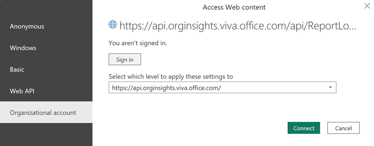
If prompted by Power BI, sign in using your organizational account. Power BI then loads and prepares the data. For large files, this process might take a few minutes.
Important
You need to sign in to Power BI with the same account you use to access Viva Insights. If available, select Organizational account from the left. You might have to sign in more than once.
Report settings
Settings page
View and set the following parameters on the Settings page. You can find Settings on the right panel of the introduction page. You can also adjust the report settings as you go through the report pages through the Settings icon.
Time period for the report – Select the time period for which you want to view data in the report.
Group by – Select the primary group-by attribute shown in all the report pages. You can change this attribute at any time and all report pages will show group values by the new attribute.
Apply filters (optional) – Select the organizational attribute and values you want to use to filter the employees shown in this report.
Customize active Copilot user definition – Customize the usage frequency for active Copilot users. You can choose between:
- At least one active day in the selected time period
- At least one active day per four weeks
- At least one active day per week
A day is marked as active if the user took at least one action with Copilot on that respective day.
Customize usage levels - Compute power, habitual, and novice users based on a 12-week rolling window (default) or a 4-week rolling window.
Report language – Change the language for your report.
About this report
The Microsoft 365 Copilot adoption report helps leaders understand Copilot usage across their organization. The insights can help accelerate Copilot adoption and help employees transform their work with Copilot.
The report is organized into the following sections (pages):
- Adoption overview
- Power users
- Glossary
1. Adoption overview
Use the Adoption overview page to get a quick, org-wide snapshot of Copilot adoption across the organization. This page helps you understand:
- Adoption level and trends
- Adoption by group
- Adoption by app and feature
From here, you can use slicers and filters (such as organizational attributes and time) to narrow the view, and then go to the deeper-dive pages to understand where adoption is strongest and identify opportunities to boost Copilot adoption and impact.
Copilot adoption trend across groups
Use this section to track adoption trends over time and identify inflection points. It helps you answer questions such as:
- How are active Copilot users trending week over week within the selected time period?
- Is growth broad-based across the organization or driven by specific groups?
- Are there sustained increases after enablement efforts (training, campaigns, champion programs)?
- How does growth in usage vary by Microsoft 365 app?
Use the benchmark selector to compare your organization to the top 25 percent of similar companies by size, industry, and region. Benchmarks are only available for the percentage of active Copilot users, and for at most 6 months of historical data. If you have queried more than 6 months of data, the benchmarks are based on the 6 most recent months of data only. Some metrics might not be available when viewing data by individual Microsoft 365 apps. Learn more about benchmarks.
Copilot adoption by group
Use this page to compare usage across groups, and quickly identify where adoption is ahead (or lagging). It helps you answer questions such as:
- Which groups have the highest (or lowest) percentage of active Copilot users?
- Which groups are generating the most Copilot actions per active user?
- Where should we focus change management efforts to increase adoption?
Copilot adoption by app and feature
Use this page to understand how Copilot usage varies across Microsoft 365 apps and experiences. It helps you answer questions such as:
- Which apps see the most Copilot usage in the organization?
- What are the most frequently used Copilot features in each app?
- Are employees using Copilot for quick wins (for example, summarization) or more advanced workflows?
- Where can we provide targeted guidance to increase usage intensity?
This view helps leaders tailor training and communications based on where people are already using Copilot, such as focusing enablement on apps and features with high potential but low usage.
2. Power users
The Power users page identifies employees and groups who are using Copilot most consistently and intensively, and highlights where "power user" behavior is concentrated in your organization. This page helps you understand:
- The mix of Copilot usage levels and power user concentration
- Copilot usage level trends
- Copilot usage levels by group
- Drivers of Copilot usage intensity
- Power user impact
Use the filters at the top of the page to filter and group the data by organizational attributes.
Copilot usage level overview
Provides an overview of the mix of Copilot usage levels across the organization. This section helps you understand:
- Are users building a habit of using Copilot? (Power users and habitual user shares)
- Who is not making use of Copilot (yet)?
- What does power user concentration look like?
Users are segmented based on how frequently and consistently they use Copilot. Users are classified into four groups:
- Power user - Someone who, on average, performs 15 or more Copilot actions per week and has used Copilot in at least 9 of the past 12 weeks
- Habitual user - Someone who averages between 1 to 14 Copilot actions per week and has also used Copilot in at least 9 of the past 12 weeks
- Novice user - Someone who has taken one or more Copilot actions in the past 12 weeks but hasn't met the threshold of using Copilot in at least 9 of those weeks
- Non-user - Someone who meets none of the above criteria
The count of users by usage level in this section is based on the last week of data. The definition of a power user can be adjusted within Settings.
Copilot adoption trend across usage levels
Use this section to track Copilot usage level trends over time and identify inflection points. It helps you answer questions such as:
- How is the mix of usage levels changing over time?
- Are we seeing the share of power users and habitual users increase?
The trendline shows week-over-week change for the selected metric, broken out by each usage level over the past 28 days. The second tab explains how Copilot usage has evolved since users initially began using it, with the trendline displaying average weekly Copilot actions taken relative to the number of weeks since first use. This section displays data only if there are users who have initiated Copilot usage within the time period available in the report, such as the last six months.
Copilot adoption by usage level and group
Use this page to compare usage levels across groups, and quickly identify where adoption is ahead (or lagging). It helps you answer questions such as:
- Which groups have the highest (or lowest) percentage of power users?
- Where is sustained Copilot usage lagging?
The chart shows the percentage of users by usage level observed over the past 28 days.
Copilot usage frequency and consistency by group
This page identifies Copilot usage in terms of frequency (average weekly actions taken) and consistency (percentage of active weeks). These insights are based on the entire timeframe you select using the report's filters. Groups positioned in the top right quadrant meet the criteria for power group status and offer valuable insights about AI scenarios. Habitual groups demonstrate consistent usage of Copilot but might have opportunities to increase their engagement frequency. To support "novice groups," consider implementing guided learning experiences to build confidence and promote greater adoption.
Novice groups
Groups are classified as novice groups if, on average, they use Copilot less than 75 percent of the weeks (meaning less than 3 out of every 4 weeks or less than 9 out of 12 weeks, depending on how usage levels are defined). To help these groups gain confidence and develop consistent habits, offer guided experiences such as step-by-step instructions, training sessions, and encourage managers to lead by example.
Habitual groups
Groups are classified as habitual groups if, on average, they use Copilot more than 75 percent of the weeks (meaning they use it at least 3 out of every 4 weeks or 9 out of 12 weeks, depending on how usage levels are defined), yet they perform fewer than 15 Copilot actions per week. To expand usage, inspire these groups with new Copilot scenarios and enable light automation of routine tasks using the prompt gallery to share the most powerful prompts.
Power groups
Groups are classified as a power group if their average weekly Copilot actions taken is equal or greater than 15 and their average percentage of active weeks is above 75 percent (meaning they use it at least 3 out of every 4 weeks or 9 out of 12 weeks, depending on how usage levels are defined). Learn from these power groups to see how they use Copilot to improve and transform their work. Showcase wins and share their proven Copilot workflows through quick demos and repeatable prompts and playbooks to help others scale this success.
Copilot adoption by app and feature
Understand how Copilot usage varies by Microsoft 365 app, feature, and usage level. The heatmap displays both the number and percentage of active Copilot users for each app (first tab) or feature (second tab), based on the most recent week of available data. The percentage of active Copilot users is calculated relative to the total licensed user population within the relevant group.
3. Glossary
View this report's metric definitions.
Power BI tips, FAQs, and troubleshooting
Learn more about how to share the report and other Power BI tips, troubleshoot any issues, or review the FAQ.