Note
Access to this page requires authorization. You can try signing in or changing directories.
Access to this page requires authorization. You can try changing directories.
APPLIES TO:  Power BI Desktop
Power BI service
Power BI Desktop
Power BI service
The card visual in Power BI displays key metrics in a flexible, visually appealing format. Each card shows a measure value with optional callout images, reference labels, and supporting details. You can display multiple cards in a single visual, break them down by categories, and customize layouts to match your report design.
Combining multiple measures and reference labels in one visual improves report performance by reducing visual load time and optimizing underlying queries to the semantic model. You can also use data-driven images to create custom visualizations that respond to your data.
Note
The (new) card visual became generally available as the card visual with the November 2025 Power BI release. Reports with the legacy card visual continue to use the legacy card visual.
Create a card visual
In the Visualizations pane, select the Build visual tab, then select the Card visual from the visual gallery.
Add a measure or any data column to the Values field well.
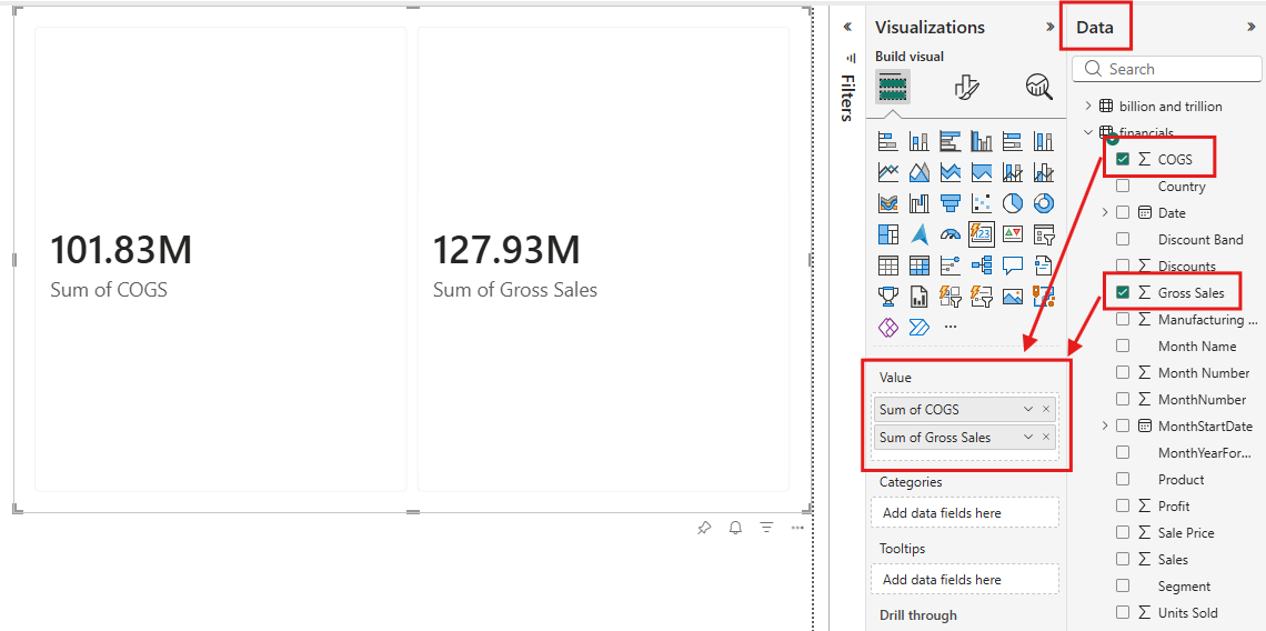
You now have a simple card. You can add as many values as you like and more cards appear.
Customize the card visual layout
The card visual offers several layout options to make your visuals more organized and visually appealing. Access these settings by selecting the Format visual icon in the Visualizations pane, then select the Visual tab.
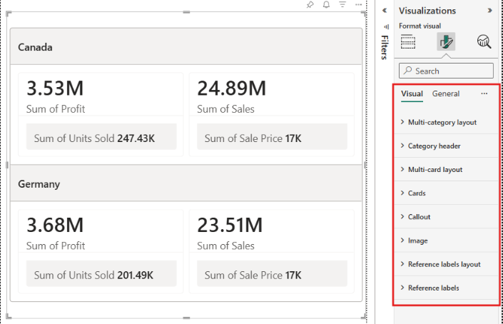
Card layout
The Cards > Layout controls how elements are arranged within each card. Each card can have three sections: callout, image, and reference labels. Use these settings to adjust the positioning, alignment, and spacing of these elements.
The card visual includes a dynamic collage layout that lets you highlight one section while the other two share the remaining space. You can also customize the display order of the callout, reference label, and hero image and give them each different background colors.
Callout layout
The Callout > Layout controls the vertical alignment and size of the callout within the callout section of each card.
Reference labels layout
The Reference labels layout setting controls how reference labels are organized within the reference labels section of each card. You can adjust the vertical and horizontal alignment of the reference labels, and customize the look and feel including gaps, padding, backgrounds, and more.
Multi-card layout
The Multi-card layout customizes how multiple cards fit within the visual container. When you have multiple values, this setting controls the arrangement of cards.
Multi-category layout
The Multi-category layout formats how each category section is laid out (such as Canada, Germany). Use this setting when you have categories added to your card visual. Within each category section, cards are arranged according to the multi-card layout settings.
Fixed size and Fit to space
In the Multicard layout section, you can control how cards are sized within the visual container:
- Fixed size: Toggle this option on to specify the exact pixel dimensions for each card. When the visual container isn't large enough to display all cards at the specified size, scroll bars appear automatically. As you resize the visual, cards maintain their specified dimensions rather than scaling proportionally.
- Fit to space: When on, cards grow or shrink to fill the visual container based on the cards present. When off, the visual reserves space for the specified number of cards, even when fewer cards exist.
Fixed size and Fit to space are mutually exclusive. When Fixed size is enabled, Fit to space is disabled since dimensions are now controlled explicitly.
Add an image
The card visual in Power BI lets you create visually appealing cards that combine metrics with multiple image options, including:
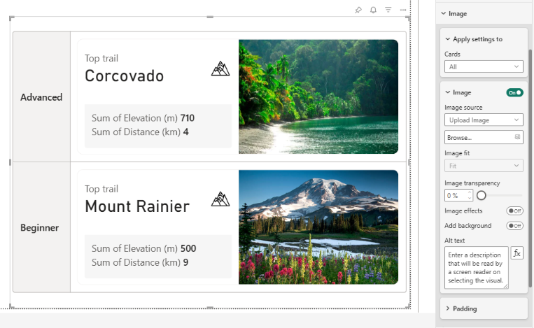
- Image: A large, prominent image that can showcase product photos, campaign graphics, or branded imagery directly within the card. Configure this option in the Image section of the format pane.
- Callout image: A smaller image within the callout that provides subtle enhancements, working well for branding elements or small visual cues without overwhelming the metric display. Configure this option in Callout > Image.
- Category header background image: A background image for category headers when you have categories added to the card visual. Configure this option in the Category header section.
To add images to your card visual:
- Add an image: With the card visual selected, select the Format visual icon in the Visualizations pane. Under the Visual tab, expand the Image card. Select your card in the Cards dropdown, and then set the Image toggle to on.
- Add a callout image: From the Visualizations pane, select the Format visual icon. Under the Visual tab, expand the Callout card. Ensure your card is selected in the Apply settings, expand the Image controls, and then set the Image toggle to on.
For all image types, you can add by uploading from your local device, pasting an image URL, or selecting an image from a data column. You can also customize the fit of the image and choose different image effects to enhance its appearance.
Image states
The Image section includes a States dropdown that lets you define separate image settings for the default and hover states. Use the hover state to change how an image appears when a user points to a card—for example, by swapping the image source, adjusting the image fit, or changing the background color.
- With the card visual selected, select the Format visual icon in the Visualizations pane.
- Under the Visual tab, expand the Image section.
- In the Apply settings to area, select the card you want to format in the Cards dropdown.
- Set States to Hover.
- Configure the image source, image fit, transparency, effects, and background color to apply when a user points to the card.
Settings you configure for the Hover state apply only when a user points to the card. The Default state controls the image's normal appearance.
Note
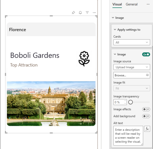
If you add a category to your card visual and all cards display the same image instead of different images, check the Apply settings to dropdown. When this setting is All, the visual applies the same image to every card. Select the specific callout value to assign different images per card, such as images from a data column.
Add categories
You can add categories to your card visual by dragging a field into the Categories field well in the Build visual section of the Visualizations pane. When you add a category, the card visual expands to display a separate section for each category value, with each section showing data sliced to that category.
The category headers are selectable and filter other visuals in the report when selected. This behavior lets users interact with your card visual to explore data across different segments.
Category selection
When you select a category header, the other category cards dim to indicate the current selection. You can:
- Select multiple categories: Hold Ctrl and select other category headers to filter by multiple values.
- Deselect a category: Select the category header again to remove it from the selection.
- Control which visuals are filtered: Use Edit interactions in the Format menu to choose which visuals on the report page are affected by selections on the card visual.
The layout of category sections is controlled by the Multi-category layout section in the format pane under the Visual tab. Within each category section, the arrangement of individual cards is still controlled by the Multi-card layout section. Elements within each card, such as the callout, image, and reference labels, are controlled by the Cards > Layout section.
Card walkthrough
Follow this walkthrough to build a comprehensive card visual step by step.
Note
This walkthrough uses the modern visual defaults preview turned on. Enable this feature in Options > Preview features > Modern visual defaults and customize theme improvements to match the examples shown.
Sample data
To follow along with the examples in this walkthrough, set up a sample table, measures, and a reusable trend function in a blank Power BI Desktop report.
Open Power BI Desktop and create a new blank report.
Select TMDL on the left side to open the TMDL view.
Paste the following TMDL script and select Apply:
createOrReplace model Model culture: en-US defaultPowerBIDataSourceVersion: powerBI_V3 sourceQueryCulture: en-US valueFilterBehavior: independent dataAccessOptions legacyRedirects returnErrorValuesAsNull table 'Product Line Sales' /// Total number of products sold across all channels and product lines. measure Units = SUM('Product Line Sales'[_Units]) formatString: #,##0 /// Total sales revenue generated from all transactions. measure Revenue = SUM('Product Line Sales'[_Revenue]) formatString: $#,##0 /// The planned revenue goal used to measure sales performance. measure 'Revenue target' = SUM('Product Line Sales'[_Revenue Target]) formatString: $#,##0 /// Total number of products returned by customers. measure Returns = SUM('Product Line Sales'[_Returns]) formatString: #,##0 /// Shows how close actual revenue is to the target (100% = on target, >100% = exceeding). measure 'Revenue % to target' = DIVIDE([Revenue], [Revenue target]) formatString: 0.0% /// Percentage of sold units that were returned (lower is better). measure 'Return rate' = DIVIDE([Returns], [Units]) formatString: 0.0% /// Dollar amount above or below the revenue target (positive = exceeding, negative = behind). measure 'Revenue variance' = [Revenue] - [Revenue target] formatString: $#,##0 measure 'Units 6mo trend' = TrendSVG([Units], 'Product Line Sales'[Month],6,3,"mmm",FALSE) displayFolder: Card images for trendlines dataCategory: ImageUrl measure 'Units 6mo trend - hover' = TrendSVG([Units], 'Product Line Sales'[Month],6,3,"mmm",TRUE) displayFolder: Card images for trendlines dataCategory: ImageUrl /// Icon showing a # symbol inside a circle to represent units. measure 'Units callout image' = "data:image/svg+xml,%3Csvg xmlns='http://www.w3.org/2000/svg' width='24' height='24' viewBox='0 0 24 24'%3E%3Ccircle cx='12' cy='12' r='10' fill='none' stroke='%230078D4' stroke-width='1.5'/%3E%3Ctext x='12' y='17' text-anchor='middle' font-family='Segoe UI' font-size='14' font-weight='600' fill='%230078D4'%3E%23%3C/text%3E%3C/svg%3E" displayFolder: Card images for callout dataCategory: ImageUrl /// Icon showing a $ symbol inside a circle to represent revenue. measure 'Revenue callout image' = "data:image/svg+xml,%3Csvg xmlns='http://www.w3.org/2000/svg' width='24' height='24' viewBox='0 0 24 24'%3E%3Ccircle cx='12' cy='12' r='10' fill='none' stroke='%23107C10' stroke-width='1.5'/%3E%3Ctext x='12' y='17' text-anchor='middle' font-family='Segoe UI' font-size='14' font-weight='600' fill='%23107C10'%3E%24%3C/text%3E%3C/svg%3E" displayFolder: Card images for callout dataCategory: ImageUrl measure 'Revenue 6mo trend' = TrendSVG([Revenue], 'Product Line Sales'[Month],6,3,"mmm",FALSE) displayFolder: Card images for trendlines dataCategory: ImageUrl measure 'Revenue 6mo trend - hover' = TrendSVG([Revenue], 'Product Line Sales'[Month],6,3,"mmm",TRUE) displayFolder: Card images for trendlines dataCategory: ImageUrl column Month formatString: mmm. yyyy summarizeBy: none isNameInferred sourceColumn: [Month] annotation SummarizationSetBy = Automatic annotation PBI_FormatHint = {"isCustom":true} column 'Product Line' summarizeBy: none isNameInferred sourceColumn: [Product Line] annotation SummarizationSetBy = Automatic column Channel summarizeBy: none isNameInferred sourceColumn: [Channel] annotation SummarizationSetBy = Automatic column _Units isHidden formatString: 0 summarizeBy: sum isNameInferred sourceColumn: [_Units] annotation SummarizationSetBy = Automatic column _Revenue isHidden formatString: 0 summarizeBy: sum isNameInferred sourceColumn: [_Revenue] annotation SummarizationSetBy = Automatic column '_Revenue Target' isHidden formatString: 0 summarizeBy: sum isNameInferred sourceColumn: [_Revenue Target] annotation SummarizationSetBy = Automatic column _Returns isHidden formatString: 0 summarizeBy: sum isNameInferred sourceColumn: [_Returns] annotation SummarizationSetBy = Automatic partition 'Product Line Sales' = calculated mode: import source = ``` VAR Anchor = DATE(YEAR(TODAY()), MONTH(TODAY()), 1) VAR M1 = EDATE(Anchor, -5) VAR M2 = EDATE(Anchor, -4) VAR M3 = EDATE(Anchor, -3) VAR M4 = EDATE(Anchor, -2) VAR M5 = EDATE(Anchor, -1) VAR M6 = Anchor RETURN SELECTCOLUMNS( { // Product Line A, Online ( M1, "A", "Online", 130, 9100, 10000, 5 ), ( M2, "A", "Online", 200, 14000, 11500, 6 ), ( M3, "A", "Online", 170, 11900, 13000, 7 ), ( M4, "A", "Online", 210, 14700, 14000, 8 ), ( M5, "A", "Online", 230, 16100, 15500, 9 ), ( M6, "A", "Online", 260, 18200, 16000, 10 ), // Product Line A, Retail ( M1, "A", "Retail", 80, 4800, 12000, 35 ), ( M2, "A", "Retail", 140, 8500, 11000, 30 ), ( M3, "A", "Retail", 100, 6000, 10500, 27 ), ( M4, "A", "Retail", 150, 9100, 9500, 24 ), ( M5, "A", "Retail", 160, 9700, 8500, 21 ), ( M6, "A", "Retail", 170, 10500, 8500, 17 ), // Product Line B, Online ( M1, "B", "Online", 280, 19600, 21000, 10 ), ( M2, "B", "Online", 380, 26600, 23000, 12 ), ( M3, "B", "Online", 340, 23800, 24500, 14 ), ( M4, "B", "Online", 410, 28700, 25500, 16 ), ( M5, "B", "Online", 470, 32900, 27000, 17 ), ( M6, "B", "Online", 520, 36400, 29000, 20 ), // Product Line B, Retail ( M1, "B", "Retail", 180, 12600, 25000, 140 ), ( M2, "B", "Retail", 270, 18900, 22000, 125 ), ( M3, "B", "Retail", 240, 16800, 21000, 110 ), ( M4, "B", "Retail", 280, 19600, 19000, 100 ), ( M5, "B", "Retail", 310, 21700, 17000, 90 ), ( M6, "B", "Retail", 320, 22400, 16000, 75 ), // Product Line C, Online ( M1, "C", "Online", 65, 7800, 8000, 2 ), ( M2, "C", "Online", 100, 12000, 9500, 2 ), ( M3, "C", "Online", 85, 10200, 11000, 3 ), ( M4, "C", "Online", 110, 13200, 12500, 3 ), ( M5, "C", "Online", 115, 13800, 13500, 4 ), ( M6, "C", "Online", 125, 15000, 15500, 4 ), // Product Line C, Retail ( M1, "C", "Retail", 100, 12000, 14000, 4 ), ( M2, "C", "Retail", 170, 20400, 15500, 4 ), ( M3, "C", "Retail", 140, 16800, 17000, 5 ), ( M4, "C", "Retail", 175, 21000, 17500, 5 ), ( M5, "C", "Retail", 180, 21600, 18000, 6 ), ( M6, "C", "Retail", 185, 22200, 18000, 7 ) }, "Month", [Value1], "Product Line", [Value2], "Channel", [Value3], "_Units", [Value4], "_Revenue", [Value5], "_Revenue Target", [Value6], "_Returns", [Value7]) ``` annotation PBI_Id = c8632d7dc9194275b03f266beb0eec91 cultureInfo en-US function TrendSVG = ``` ( valueExpr: ANYREF EXPR, periodCol: ANYREF EXPR, periods: INT64, labelChars: INT64, dateFormat: STRING, hover: BOOLEAN ) => VAR _LastPeriod = MAX ( periodCol ) // Take the N most-recent distinct values of periodCol at or before the // current filter context's max — grain-agnostic (day / month / year / etc.) VAR _BasePeriods = TOPN ( periods, FILTER ( ALL ( periodCol ), periodCol <= _LastPeriod ), periodCol, DESC ) VAR _Data = ADDCOLUMNS ( _BasePeriods, "Value", VAR _v = CALCULATE ( valueExpr ) RETURN IF ( ISBLANK ( _v ), 0, _v ) ) VAR _DataIndexed = ADDCOLUMNS ( _Data, "Idx", RANKX ( _Data, periodCol, periodCol, ASC, DENSE ), "PeriodLabel", UPPER ( LEFT ( FORMAT ( periodCol, dateFormat ), labelChars ) ) ) VAR _Count = COUNTROWS ( _DataIndexed ) VAR _MaxVal = MAXX ( _DataIndexed, [Value] ) // Layout — width scales with period count so labels never crowd VAR _PerPointX = 32 // horizontal space reserved per data point VAR _PadX = 18 VAR _Width = 2 * _PadX + MAX ( 1, _Count - 1 ) * _PerPointX VAR _Height = 86 VAR _PadTop = 10 VAR _LabelBandH = 26 VAR _ChartBottom = _Height - _LabelBandH VAR _GoodColor = "#107C10" VAR _BadColor = "#A80000" VAR _LineColor = "#0078D4" VAR _XStep = IF ( _Count > 1, DIVIDE ( _Width - 2 * _PadX, _Count - 1 ), 0 ) VAR _HasData = _Count >= 2 && NOT ISBLANK ( _MaxVal ) // Polyline point list ("x,y x,y ...") VAR _Points = CONCATENATEX ( _DataIndexed, VAR _Idx = [Idx] VAR _Val = [Value] VAR _Norm = IF ( _MaxVal = 0, 0, DIVIDE ( _Val, _MaxVal ) ) VAR _X = _PadX + ( _Idx - 1 ) * _XStep VAR _Y = _ChartBottom - _Norm * ( _ChartBottom - _PadTop ) RETURN FORMAT ( _X, "0.0" ) & "," & FORMAT ( _Y, "0.0" ), " ", [Idx], ASC ) // Dot marker on every point VAR _Markers = CONCATENATEX ( _DataIndexed, VAR _mIdx = [Idx] VAR _mVal = [Value] VAR _mNorm = IF ( _MaxVal = 0, 0, DIVIDE ( _mVal, _MaxVal ) ) VAR _mX = _PadX + ( _mIdx - 1 ) * _XStep VAR _mY = _ChartBottom - _mNorm * ( _ChartBottom - _PadTop ) RETURN "<circle cx='" & FORMAT ( _mX, "0.0" ) & "' cy='" & FORMAT ( _mY, "0.0" ) & "' r='2.2' fill='" & _LineColor & "' />", "", [Idx], ASC ) // Light vertical guide from each marker down to the label band VAR _GuideBottom = _ChartBottom VAR _Guides = CONCATENATEX ( _DataIndexed, VAR _gIdx = [Idx] VAR _gVal = [Value] VAR _gNorm = IF ( _MaxVal = 0, 0, DIVIDE ( _gVal, _MaxVal ) ) VAR _gX = _PadX + ( _gIdx - 1 ) * _XStep VAR _gY = _ChartBottom - _gNorm * ( _ChartBottom - _PadTop ) RETURN "<line x1='" & FORMAT ( _gX, "0.0" ) & "' y1='" & FORMAT ( _gY, "0.0" ) & "' x2='" & FORMAT ( _gX, "0.0" ) & "' y2='" & FORMAT ( _GuideBottom, "0.0" ) & "' stroke='#CCCCCC' stroke-width='0.75' />", "", [Idx], ASC ) // Period label (e.g. "JAN") — bottom band, upper row VAR _LabelY = _Height - 16 VAR _Labels = CONCATENATEX ( _DataIndexed, VAR _lIdx = [Idx] VAR _lX = _PadX + ( _lIdx - 1 ) * _XStep RETURN "<text x='" & FORMAT ( _lX, "0.0" ) & "' y='" & FORMAT ( _LabelY, "0.0" ) & "' text-anchor='middle' font-family='DIN, "DIN Alternate", "DIN Next", "Segoe UI", Tahoma, Arial, sans-serif' font-size='8' fill='#666'>" & [PeriodLabel] & "</text>", "", [Idx], ASC ) // ---- Hover-only content ---- // Shaded area under each segment (green if rising, red if falling) VAR _Shades = CONCATENATEX ( FILTER ( _DataIndexed, [Idx] < _Count ), VAR _sIdx = [Idx] VAR _sVal = [Value] VAR _sNext = MAXX ( FILTER ( _DataIndexed, [Idx] = _sIdx + 1 ), [Value] ) VAR _sNorm1 = IF ( _MaxVal = 0, 0, DIVIDE ( _sVal, _MaxVal ) ) VAR _sNorm2 = IF ( _MaxVal = 0, 0, DIVIDE ( _sNext, _MaxVal ) ) VAR _sX1 = _PadX + ( _sIdx - 1 ) * _XStep VAR _sX2 = _PadX + _sIdx * _XStep VAR _sY1 = _ChartBottom - _sNorm1 * ( _ChartBottom - _PadTop ) VAR _sY2 = _ChartBottom - _sNorm2 * ( _ChartBottom - _PadTop ) VAR _sColor = IF ( _sNext >= _sVal, _GoodColor, _BadColor ) RETURN "<polygon points='" & FORMAT ( _sX1, "0.0" ) & "," & FORMAT ( _sY1, "0.0" ) & " " & FORMAT ( _sX2, "0.0" ) & "," & FORMAT ( _sY2, "0.0" ) & " " & FORMAT ( _sX2, "0.0" ) & "," & FORMAT ( _ChartBottom, "0.0" ) & " " & FORMAT ( _sX1, "0.0" ) & "," & FORMAT ( _ChartBottom, "0.0" ) & "' fill='" & _sColor & "' fill-opacity='0.05' stroke='none' />", "", [Idx], ASC ) // Bold value label — bottom band, lower row VAR _ValueLabelY = _Height - 6 VAR _DataLabels = CONCATENATEX ( _DataIndexed, VAR _dIdx = [Idx] VAR _dVal = [Value] VAR _dX = _PadX + ( _dIdx - 1 ) * _XStep RETURN "<text x='" & FORMAT ( _dX, "0.0" ) & "' y='" & FORMAT ( _ValueLabelY, "0.0" ) & "' text-anchor='middle' font-family='DIN, "DIN Alternate", "DIN Next", "Segoe UI", Tahoma, Arial, sans-serif' font-size='7' font-weight='bold' fill='#333'>" & FORMAT ( _dVal, "#,0" ) & "</text>", "", [Idx], ASC ) // Assemble VAR _HoverExtras = IF ( hover, _Shades, "" ) VAR _HoverLabels = IF ( hover, _DataLabels, "" ) VAR _SVGContent = "<svg xmlns='http://www.w3.org/2000/svg' viewBox='0 0 " & FORMAT ( _Width, "0" ) & " " & FORMAT ( _Height, "0" ) & "' preserveAspectRatio='xMidYMid meet'>" & _HoverExtras & _Guides & "<polyline fill='none' stroke='" & _LineColor & "' stroke-width='1.5' stroke-linecap='round' stroke-linejoin='round' points='" & _Points & "' />" & _Markers & _Labels & _HoverLabels & "</svg>" RETURN IF ( _HasData, "data:image/svg+xml;utf8," & _SVGContent, BLANK () ) ``` annotation __PBI_TimeIntelligenceEnabled = 0 annotation PBI_QueryOrder = [] annotation PBI_ProTooling = ["TMDLView_Desktop"]The script creates the Product Line Sales table with six months of sample data, the base measures used throughout the walkthrough, callout icon measures (
Units callout image,Revenue callout image), trend measures (Units 6mo trend,Units 6mo trend - hover,Revenue 6mo trend,Revenue 6mo trend - hover), and a reusableTrendSVGDAX user-defined function that renders an SVG line chart with an optional hover variant.
Create a basic card
In the Visualizations pane, select the Build visual tab, then select the Card visual from the visual gallery.
Drag Units to the Values field well.
Drag Revenue to the Values field well.
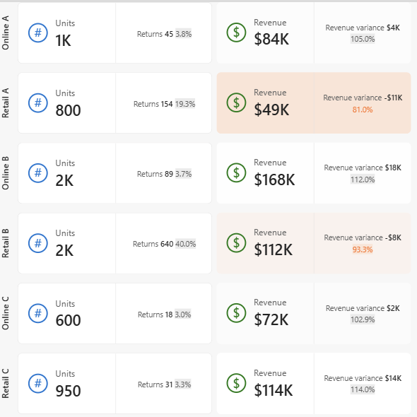
You now have a multi-card visual displaying total units and total revenue.
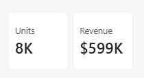
Add a callout image
To make your card more visually engaging, add an image to the callout area. The initial TMDL script already created two measures that return simple SVG icons: Units callout image (a # symbol inside a circle) and Revenue callout image (a $ symbol inside a circle). To assign them to the cards:
- Select your card visual.
- In the Visualizations pane, select the Format visual icon.
- Under the Visual tab, expand Callout.
- In the Apply settings to dropdown, select Units.
- Expand Image and toggle it to On.
- Set Image type to Select from data.
- Select Units callout image from the field dropdown.
- Set Image fit to Center.
- Set Size to 40 px.
- In the Apply settings to dropdown, select Revenue.
- Expand Image and toggle it to On.
- Set Image type to Select from data.
- Select Revenue callout image from the field dropdown.
- Set Image fit to Center.
- Set Size to 40 px.
Each card now displays a symbol icon in the callout area alongside its metric value.
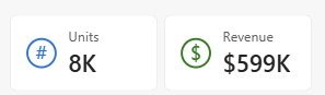
Show by category
Add a category to display your data broken down by segment.
- In the Data pane, drag Channel to the Categories field well.
- Drag Product Line to the Categories field well to further break down the data by product line within each channel.
- In the Visualizations pane, select the Format visual icon.
- Under the Visual tab, expand Multi-category layout.
- Expand Layout, toggle Fit to space to Off, and set Rows to 6 to display all categories.
Note
When Fit to space is on, the maximum number of rows is 4. To display more rows, turn off Fit to space.
The card visual now shows a separate section for each channel and product line combination, with each section displaying units and revenue along with their callout images.
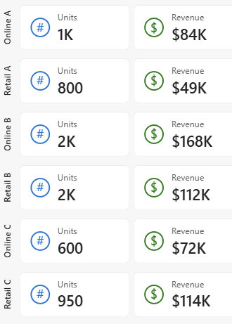
Add reference labels
Reference labels provide context for your main metric. You can also add detail values to reference labels for more granular information.
- In the Visualizations pane, select the Format visual icon.
- Under the Visual tab, expand the Reference labels section.
- In the Apply settings to dropdown, select Units.
- Drag Returns to the Add label data field.
- In the Add label dropdown, select Returns.
- Expand the Detail section and toggle it to On.
- Drag Return rate to the Details data field.
- In the Apply settings to dropdown, select Revenue.
- Drag Revenue variance to the Add label data field.
- In the Add label dropdown, select Revenue variance.
- Expand the Detail section and toggle it to On.
- Drag Revenue % to target to the Details data field.
Your cards now display reference labels with details: the Units card shows returns with return rate, and the Revenue card shows revenue variance with percentage to target. You can further format reference labels, including using conditional formatting to adjust colors based on values.
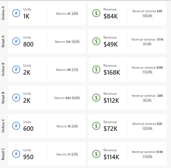
Add a top-level image
The card visual can display an image alongside the callout value instead of inside it. This layout is helpful for larger images and for SVGs that show more detail than a small callout icon, such as a trend line.
For this example, first simplify the card by removing the earlier extras so the trend chart can take the spotlight:
- Select your card visual.
- From the Categories field well, remove Channel and Product Line.
- In the Visualizations pane, select the Format visual icon.
- Under the Visual tab, expand Reference labels. In the Apply settings to dropdown, select All, and then select Reset to default at the bottom of the section.
Now use the trend measures created in the initial TMDL script to display a compact line chart, and switch to a richer variant when a user points to the card.
The Units 6mo trend, Units 6mo trend - hover, Revenue 6mo trend, and Revenue 6mo trend - hover measures all call the reusable TrendSVG DAX user-defined function to render an SVG line chart over the last six months. The hover variants add shaded segments (green when rising, red when falling) and bold value labels for each period.
To display the trend chart as the top-level image on each card, and switch to the hover variant when a user points to the card:
- Select your card visual.
- In the Visualizations pane, select the Format visual icon.
- Under the Visual tab, expand the Image section.
- In the Apply settings to dropdown, select Cards = Units.
- Set States to Default.
- Toggle Image to On.
- Set Image source to Select from data.
- Select Units 6mo trend from the field dropdown.
- Set Image fit to Fit.
- Set States to Hover.
- Toggle Image to On.
- Set Image source to Select from data.
- Select Units 6mo trend - hover from the field dropdown.
- Set Image fit to Fit.
- In the Apply settings to dropdown, select Cards = Revenue.
- Set States to Default.
- Toggle Image to On.
- Set Image source to Select from data.
- Select Revenue 6mo trend from the field dropdown.
- Set Image fit to Fit.
- Set States to Hover.
- Toggle Image to On.
- Set Image source to Select from data.
- Select Revenue 6mo trend - hover from the field dropdown.
- Set Image fit to Fit.
Each card now shows a line chart of the trailing six months of its metric alongside the callout value. When a user points to a card, the chart swaps to the hover variant with shaded rise and fall segments and value labels.
To emphasize the trend charts alongside the callout values, adjust the card layout:
- Under Callout, turn off the Image toggle for each card to remove the callout icons.
- Under Cards > Layout, set Arrangement to Horizontal.
- Set the Order to Callout, Image, Reference labels.
- Set Callout size to 40%.

Apply conditional formatting
You can conditionally format many elements in the card visual, such as font color, background color, and border color. Use conditional formatting to draw attention to specific cards based on the underlying data. For example, highlight a card where revenue falls short of its target. For details on the available rule types and how to configure them, see Conditional formatting overview.
Legacy single card and multi-card visuals
Before the November 2025 release, Power BI included two separate card visuals: the single card visual for displaying one measure and the multi-card visual for displaying multiple measures. These legacy visuals remain available for backward compatibility. Existing reports using these visuals continue to render without changes.
The new card visual replaces both legacy visuals and is recommended for new reports. When you select the Card icon in the Visualizations pane, it creates the new card visual introduced in the November 2025 general availability release.
To access the legacy single card and multi-card visuals:
- In the Visualizations pane, select the three dots (...).
- Select Restore default visuals.
The legacy visuals appear in the unpinned area of the Visualizations pane, where custom visuals typically appear. Users who need to maintain legacy behavior should continue using existing legacy card visuals in their reports.
Considerations and limitations
Frequently asked questions for cards used in reports during preview
Why does the column setting reset to 10 or the row setting reset to 10 when I previously set it to a different number?
During preview, you could set a column or row number for a grid, vertical, or horizontal arrangement of cards. After the November 2025 release, only the grid arrangement setting is kept. Vertical and horizontal arrangements reset to 10 columns and 10 rows on existing reports, including published reports. Scrollbars may appear in your existing card visuals to accommodate these settings. Only reports published or created with the card visual during preview are impacted.
To return your cards to the previous column and row number, update these settings in the November 2025 Power BI Desktop and publish the report or edit the report in the web.
Why do the cards take up more space?
During preview, the default settings had less padding in the cards. After the November 2025 release, more padding and padding options were added to the card. The new default is 12px.
To find and adjust these settings, search for “Padding” in the format pane and adjust as needed. In some cases, toggling on individual padding can restore previous padding settings.
Padding can be set in a custom theme file or added to your own custom theme file to apply them to all cards in your report.
{
  "$schema": "https://raw.githubusercontent.com/microsoft/powerbi-desktop-samples/main/Report%20Theme%20JSON%20Schema/reportThemeSchema-2.149.json",
  "name": "CardVisualGA",
  "visualStyles": {
    "cardVisual": {
      "*": {
        "*": [{
            "$id": "default",
            "paddingUniform": 0
        }]
      }
    }
  }
}
For more information, see Power BI report themes.
Why is there a reference label area on cards without a reference label?
During preview, the reference labels were part of the callout area when the divider was turned off. After November 2025, the reference labels have their own area. Once an area is used in at least one card, the other cards keep that area available to maintain consistency across cards.
Why is the reference label obscuring the text in the callout?
During preview, the reference labels were part of the callout area. After November 2025, the reference labels have their own area. They also now take up 50% of the card by default.
To adjust the card area sizes, go to Cards, make sure the Apply setting to control is set to All, then in Layout adjust the Callout size %.
Why is there a background color added to the card reference label?
During preview, the background color only showed when the reference label had a divider. The divider gave the reference labels their own area in the card to then apply a background to. After the November 2025 release, reference labels always have their own area with or without a divider, and a default background is used.
The background can be turned off by going to reference labels layout > background in the format pane and toggling off the setting.
This setting can be set in a custom theme file or added to your own custom theme file to apply them to all cards in your report.
{
  "$schema": "https://raw.githubusercontent.com/microsoft/powerbi-desktop-samples/main/Report%20Theme%20JSON%20Schema/reportThemeSchema-2.149.json",
  "name": "CardVisualGA",
  "visualStyles": {
    "cardVisual": {
      "*": {
        "*": [{
            "$id": "default",
            "backgroundTransparency": 100
        }]
      }
    }
  }
}
For more information, see Power BI report themes.
Why can’t I see my image settings in the format pane?
During preview, the callout image was added using the Image section of the format pane and showed in the callout area next to the text. After November 2025, those images previously added were kept in the callout area, and their settings moved to Callout > Image section in the format pane. Setting the Image section of the format pane now adds a new image to the card with its own area.
Why is my image now zoomed in?
During preview, the default settings for size of the image had some bugs corrected by the November 2025 update. Depending on your initial settings, the image can look “zoomed in” or different from before.
To fix the image, in the format pane, adjust the Callout > Image settings for image fit to be fit or center, and check the size and image area size controls in the same formatting section. Note this setting is in a new location, and the top-level Image section is now for the card image.
Why is my category header image gone?
Go to Category header settings and turn back on add image. Your image should still be there.
Why does the new card visual in a published report look different than it looks in Desktop?
Differences between Desktop and the service can happen in two scenarios.
- You're using a version of Desktop before November 2025, when the card was in preview. When published to the service it was upgraded to be the generally available version of the new card visual. Either update your Power BI Desktop or edit the report in the web after publishing to adjust the style.
- You're using November 2025 version of Power BI Desktop, and the update for the generally available card isn't in your service region. Once the service region is updated, the card looks the same. This behavior should only happen in a few regions in late November 2025.
Default behavior changes from preview
During preview, the card visual's default behavior was different to how it now behaves in general availability. At general availability, we made updates to enhance the layout consistency, visual alignment, and overall user experience.
- Callout image alignment: During preview, the callout image aligned was constrained to the callout label text, which may leave part of the callout container empty. Now the image aligns to the callout container.
- Background image fit: During preview, the background image could repeat to fill the container. Now the image fit options align with other visual image options of fit, stretch, fill, and center.
- Reference label outer padding: During preview, reference labels had an outer padding setting that unintentionally affected the callout area by pushing elements out of place around the divider. Now the outer padding setting is removed from reference labels.
- Fit to space (renamed from Autogrid): During preview, the visuals would leave an empty column to match the specified number of columns. With the addition of Fit to space, it arranges cards to fill the visual container based on the cards present. This setting can be toggled off to return to previous behavior.
Format settings
- The (new) card visual is generally available as the card visual with the November 2025 Power BI release. If you used the card visual during the preview phase, you might notice behavior or formatting changes that reflect the improvements in the general availability release.
- The new Card visual includes updated default styling. Newly created cards might look different from legacy cards and from cards created during preview, while existing visuals remain unchanged.
- When formatting the card visual, you might notice that some of the format settings are in a different or new location, or the name of the setting is changed.
- In earlier versions of the card visual, the Callout image was available as part of the Image card. This image is now in the Callout section of the Format pane.
- Certain Layout arrangements might affect existing reports that used the card visual during its preview phase. This effect is due to updates made to all card components as part of the general availability release, including enhancements to layout, styling, and image handling.
- If you previously relied on the Image card layout, update your visuals accordingly by using the Format pane to access and configure the Callout image settings.