Note
Access to this page requires authorization. You can try signing in or changing directories.
Access to this page requires authorization. You can try changing directories.
This article guides you on how to view API usage metrics for your Azure Maps account in the Azure portal. The metrics are displayed in an easy-to-read graph format over a customizable time period.
View metric snapshot
The Overview page of your Maps account displays key metrics such as Total Requests, Total Errors, and Availability over a selectable time period.
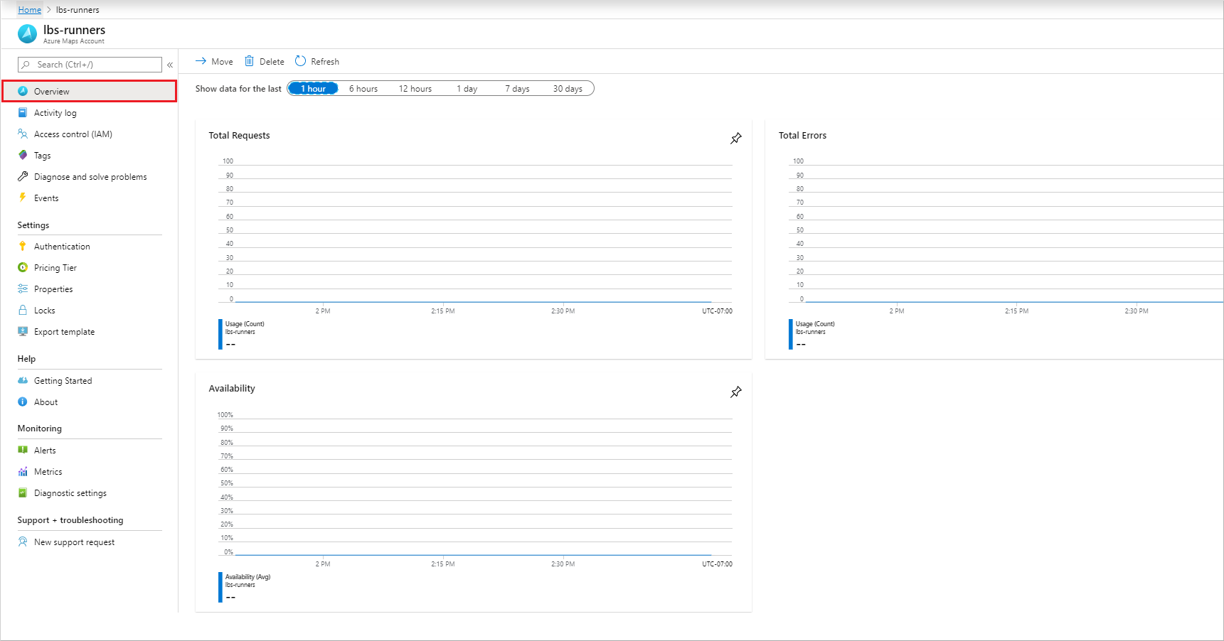
Proceed to the next section to customize these graphs for your specific analysis needs.
View detailed metrics
Sign in to the Azure portal.
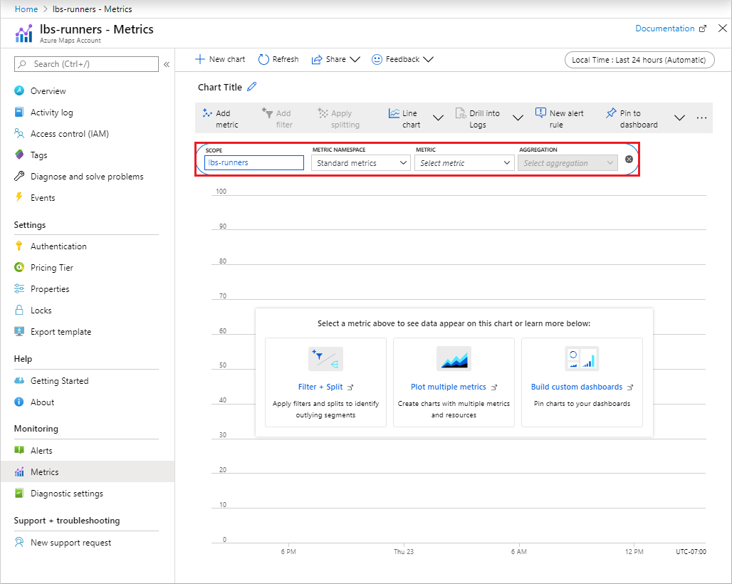
Select the All resources menu item on the left-hand side and navigate to your Azure Maps Account.
Once your Maps account is open, select the Metrics menu on the left.
In the Metrics pane, choose one of the following options:
Availability - displays the Average API availability over a specified time period.
Usage - displays the usage count for your account.
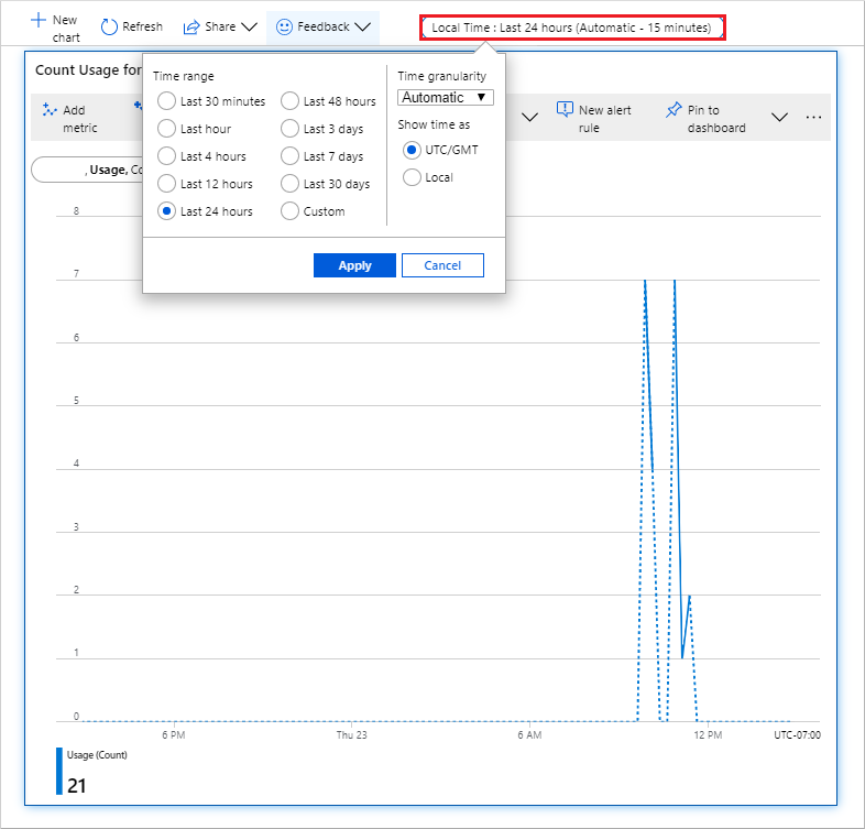
The default time range is Last 24 hours (Automatic). To change this, select the default value to open the Time Range pop-up, which displays all available settings. You can change the Time granularity and show the time as local or GMT. Once the desired options are chosen, select Apply.
Note
Metrics are stored for 93 days, but you can only query up to 30 days' worth of data at a time. If you encounter a blank chart or partial metric data, ensure the start and end dates in the time picker don't exceed a 30-day interval. Once you've selected a 30-day interval, you can pan the chart to view other metrics. For more information, see Troubleshooting metrics charts.
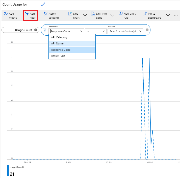
After adding your metric, you can apply a filter based on the properties relevant to that metric. Then, choose the value of the property you want to display on the graph.
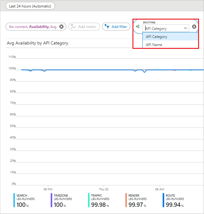
You can also Apply splitting for your metric based on your selected metric property. This feature allows the graph to be divided into multiple graphs, each representing a different value of that property. In the following example, the color of each graph corresponds to the property value displayed at the bottom.
You can also view multiple metrics on the same graph by selecting the Add metric button.
Next steps
Discover more about the Azure Maps APIs you wish to monitor: