Note
Access to this page requires authorization. You can try signing in or changing directories.
Access to this page requires authorization. You can try changing directories.
Question
Saturday, April 5, 2014 5:44 PM | 3 votes
In Excel 2013 I'm trying to specify the interval unit between labels on the x-axis to 1440 but it will not allow me to enter any number higher than 255. Is there a way to change this?
All replies (7)
Monday, April 14, 2014 7:36 AM ✅Answered
No, there is no way to set the column width more than 255 in Excel Worksheet. This is Excel limits:
http://office.microsoft.com/en-us/excel-help/excel-specifications-and-limits-HA103980614.aspx
Tony Chen
TechNet Community Support
Thursday, September 11, 2014 10:30 AM | 2 votes
The issue i believe is the maximum interval between tick marks is now 255. This is insufficient is for example i want to plot a a dataset with a 5second sampling rate over several days.... I want to be able to show the data with HOURLY tick marks, with 255 the axis labelling looks overly complicated.
This is making using Excel2013 difficult to produce good looking graphs for reports etcs - definitely a backwards step
Tuesday, October 21, 2014 2:15 PM | 1 vote
They weren't asking about column width they're asking about interval unit, it's two different things. I'm having the same problem, any solution?
Friday, July 15, 2016 9:48 PM | 1 vote
This question had nothing to do with the Column Width. This is not the answer.
I'm having the same problem. In a chart, you cannot change the Interval Unit of the Labels on the X-Axis.
I can't believe that a powerful industry standard tool like Excel doesn't have a way around this. Has anyone found a solution to this problem?!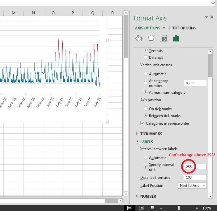
Saturday, October 22, 2016 3:24 PM | 1 vote
I use Excel for automated reporting and am working with data sets of one to several hundred thousand samples and this interval issue has been a nightmare for years.
I think this limit is probably to do with the spacing for the maximum bar type series, which is then not unreasonable.
In a Line chart these are just labels and not data so there is probably an assumption that there will not be a data-dependent label for every Y value - usually just a time. If the X-values are indeed Y-related data then an X/Y Scatter plot is the answer
This problem can be sorted quite easily however and I have implemented a solution, which seems to work well. Here goes…
- The solution is based upon manipulating the source data rather than the chart option
- To fully populate the X-Axis with labels across the full Y data range there needs to be an equal count of labels to samples.
- So add a new column alongside the Y data and formulaically determine where you want a label to be – based upon how many labels you want, intervals etc.
I use the following:
- Enter an interval gap in time or a number of labels you want
- Calculate the number of samples between labels say labelGap
- Add a modulo counter alongside the data using labelGap as the mod value so that when we have no remainder i.e. value = 0, we copy the Label value over. When there is a remainder i.e. in between the desired label gap we set the cell value to an empty string.
- If you then use this column of filtered labels as your X-Axis labels, the axis label interval is then completely in your control and is changed by simply changing the interval values in your cells.
So if we have 1000 samples and wanted 10 equally spaced labels in the chart, every 100th row would have a value and in between just blanks.
If anyone wants I will post an example file.
Wednesday, November 16, 2016 9:16 AM
Could you please post an example?
Thank you
Monday, December 19, 2016 9:33 PM | 2 votes
Way to go not bothering to understand the question before marking yourself as the answer.